Appendix E — Hypothesis Test A

E.1 Overview

This document focuses on testing the thesis hypothesis (Test A) using the methods described in the supplemental material titled Methods.

The assumptions addressed here are those relevant to general linear models, with further information available in the supplemental material titled Overview of General Linear Models.

As with all analyses in this thesis, the process is fully reproducible and was conducted using the R programming language (R Core Team, n.d.) along with the Quarto publishing system (Allaire et al., n.d.).

E.2 Setting the Enviroment

Code
source(here::here("R", "cohens_f_squared.R"))
source(here::here("R", "normality_summary.R"))
source(here::here("R", "panel_tabset_coef_dfbetas.R"))
source(here::here("R", "panel_tabset_var_distribution.R"))
source(here::here("R", "panel_tabset_var_homoscedasticity.R"))
source(here::here("R", "plot_box_plot.R"))
source(here::here("R", "plot_ggally.R"))
source(here::here("R", "plot_hist.R"))
source(here::here("R", "plot_qq.R"))
source(here::here("R", "stats_summary.R"))
source(here::here("R", "test_normality.R"))
source(here::here("R", "utils.R"))
source(here::here("R", "utils-checks.R"))
source(here::here("R", "utils-plots.R"))
source(here::here("R", "utils-stats.R"))

E.3 Loading and Processing the Data

Assumption 1
Predictor is known. Either the vectors \(z_{1}, \dots , z_{n}\) are known ahead of time, or they are the observed values of random vectors \(Z_{1}, \dots , Z_{n}\) on whose values we condition before computing the joint distribution of (\(Y_{1}, \dots , Y_{n}\)) (DeGroot & Schervish, 2012, p. 736).

Assumption 1 is satisfied, as the predictors are known.

Code
targets::tar_make(script = here::here("_targets.R"))

This data processing is performed solely for the purpose of the analysis. The variables undergo numerical transformations to streamline the modeling process and minimize potential errors.

Code
data <- 
  targets::tar_read("weighted_data", store = here::here("_targets")) |>
  dplyr::select(
    msf_sc, age, sex, longitude, ghi_month, ghi_annual, 
    march_equinox_daylight, june_solstice_daylight,
    december_solstice_daylight, cell_weight
  ) |>
  dplyr::mutate(
    dplyr::across(
      .cols = dplyr::ends_with("_daylight"),
      .fns = ~ .x |> as.numeric()
    )
  ) |>
  dplyr::mutate(
    msf_sc = 
      msf_sc |>
      lubritime:::link_to_timeline(threshold = hms::parse_hms("12:00:00")) |>
      as.numeric()
  ) |>
  tidyr::drop_na()
data |>
  dplyr::select(-cell_weight) |>
  report::report()
#> The data contains 65823 observations of the following 9 variables:
#> 
#>   - msf_sc: n = 65823, Mean = 16120.91, SD = 5172.84, Median = 15685.71, MAD =
#> 5210.28, range: [1542.86, 30578.57], Skewness = 0.27, Kurtosis = -0.25, 0%
#> missing
#>   - age: n = 65823, Mean = 32.11, SD = 9.26, Median = 30.70, MAD = 9.42,
#> range: [18, 58.95], Skewness = 0.66, Kurtosis = -0.19, 0% missing
#>   - sex: 2 levels, namely Female (n = 43728, 66.43%) and Male (n = 22095,
#> 33.57%)
#>   - longitude: n = 65823, Mean = -45.81, SD = 4.05, Median = -46.59, MAD =
#> 3.87, range: [-57.11, -34.81], Skewness = 0.65, Kurtosis = 0.47, 0% missing
#>   - ghi_month: n = 65823, Mean = 5103.14, SD = 545.25, Median = 5050.00, MAD =
#> 593.04, range: [3508, 6699], Skewness = 0.03, Kurtosis = -0.04, 0% missing
#>   - ghi_annual: n = 65823, Mean = 4766.14, SD = 412.12, Median = 4726.00, MAD
#> = 453.68, range: [3639, 6061], Skewness = 0.29, Kurtosis = -0.35, 0% missing
#>   - march_equinox_daylight: n = 65823, Mean = 43607.03, SD = 9.15, Median =
#> 43609.35, MAD = 5.11, range: [43588.57, 43642.80], Skewness = -0.02,
#> Kurtosis = 0.41, 0% missing
#>   - june_solstice_daylight: n = 65823, Mean = 39058.59, SD = 1384.27, Median =
#> 38622.60, MAD = 549.10, range: [35740.28, 43710.78], Skewness = 1.31,
#> Kurtosis = 1.65, 0% missing
#>   - december_solstice_daylight: n = 65823, Mean = 48318.08, SD = 1420.94,
#> Median = 48762.49, MAD = 568.08, range: [43582.40, 51774.49], Skewness =
#> -1.28, Kurtosis = 1.59, 0% missing

E.4 Conducting a Power Analysis

The results indicate that at least \(1,895\) observations per variable are required to achieve a power of \(0.99\) (\(1 - \beta\)) (the probability of not committing a type II error) and a significance level (\(\alpha\)) of \(0.01\) (\(0.99\) probability of not committing a type I error). The dataset contains \(65,823\) observations, which exceeds this requirement.

pwr_analysis <- pwrss::pwrss.f.reg(
  f2 = 0.02, # Minimal Effect Size (MES).
  k = length(data) - 2, # Number of predictors (-msf_sc, -cell_weight).
  power = 0.99,
  alpha = 0.01
)
#>  Linear Regression (F test) 
#>  R-squared Deviation from 0 (zero) 
#>  H0: r2 = 0 
#>  HA: r2 > 0 
#>  ------------------------------ 
#>   Statistical power = 0.99 
#>   n = 1895 
#>  ------------------------------ 
#>  Numerator degrees of freedom = 8 
#>  Denominator degrees of freedom = 1885.64 
#>  Non-centrality parameter = 37.893 
#>  Type I error rate = 0.01 
#>  Type II error rate = 0.01
Code
pwrss::power.f.test(
  ncp = pwr_analysis$ncp,
  df1 = pwr_analysis$df1,
  df2 = pwr_analysis$df2,
  alpha = pwr_analysis$parms$alpha,
  plot = TRUE
)
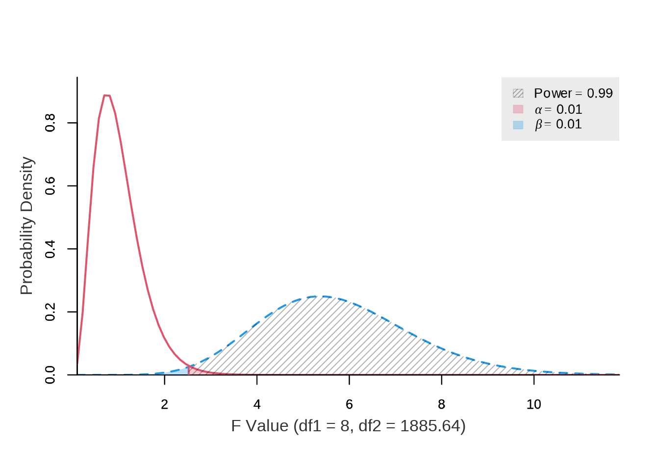
Figure E.1: Power analysis for the hypothesis test.

#>        power ncp.alt ncp.null alpha df1         df2      f.crit
#>  0.989999999  37.893        0  0.01   8 1885.639848 2.520678643

Source: Created by the author.

E.5 Examining Distributions

Code
data |>
  stats_summary(
    col = 'msf_sc',
    name = 'MSF~sc~ (Chronotype proxy) (seconds)',
    as_list = FALSE
  )
Table E.1: Statistics for the msf_sc variable.
Code
data |>
  test_normality(
    col = 'msf_sc',
    name = 'MSF~sc~ (Chronotype proxy) (seconds)'
  )
#> Registered S3 method overwritten by 'quantmod':
#>   method            from
#>   as.zoo.data.frame zoo
Figure E.2: Histogram of the msf_sc variable with a kernel density estimate, along with a quantile-quantile (Q-Q) plot between the variable and the theoretical quantiles of the normal distribution.

Code
data |>
  plot_box_plot(
    col = 'msf_sc'
  )
Figure E.3: Boxplot of the msf_sc variable.

Code
data |>
  stats_summary(
    col = 'age',
    name = 'Age (years)',
    as_list = FALSE
  )
Table E.2: Statistics for the age variable.
Code
data |>
  test_normality(
    col = 'age',
    name = 'Age (years)'
  )
Figure E.4: Histogram of the age variable with a kernel density estimate, along with a quantile-quantile (Q-Q) plot between the variable and the theoretical quantiles of the normal distribution.

Code
data |>
  plot_box_plot(
    col = 'age'
  )
Figure E.5: Boxplot of the age variable.

Code
data |>
  stats_summary(
    col = 'longitude',
    name = 'Longitude (decimal degrees)',
    as_list = FALSE
  )
Table E.3: Statistics for the longitude variable.
Code
data |>
  test_normality(
    col = 'longitude',
    name = 'Longitude (decimal degrees)'
  )
Figure E.6: Histogram of the longitude variable with a kernel density estimate, along with a quantile-quantile (Q-Q) plot between the variable and the theoretical quantiles of the normal distribution.

Code
data |>
  plot_box_plot(
    col = 'longitude'
  )
Figure E.7: Boxplot of the longitude variable.

Code
data |>
  stats_summary(
    col = 'ghi_month',
    name = 'Monthly average global horizontal irradiance (Wh/m²)',
    as_list = FALSE
  )
Table E.4: Statistics for the ghi_month variable.
Code
data |>
  test_normality(
    col = 'ghi_month',
    name = 'Monthly average global horizontal irradiance (Wh/m²)'
  )
Figure E.8: Histogram of the ghi_month variable with a kernel density estimate, along with a quantile-quantile (Q-Q) plot between the variable and the theoretical quantiles of the normal distribution.

Code
data |>
  plot_box_plot(
    col = 'ghi_month'
  )
Figure E.9: Boxplot of the ghi_month variable.

Code
data |>
  stats_summary(
    col = 'ghi_annual',
    name = 'Annual average global horizontal irradiance (Wh/m²)',
    as_list = FALSE
  )
Table E.5: Statistics for the ghi_annual variable.
Code
data |>
  test_normality(
    col = 'ghi_annual',
    name = 'Annual average global horizontal irradiance (Wh/m²)'
  )
Figure E.10: Histogram of the ghi_annual variable with a kernel density estimate, along with a quantile-quantile (Q-Q) plot between the variable and the theoretical quantiles of the normal distribution.

Code
data |>
  plot_box_plot(
    col = 'ghi_annual'
  )
Figure E.11: Boxplot of the ghi_annual variable.

Code
data |>
  stats_summary(
    col = 'march_equinox_daylight',
    name = 'Daylight on the March equinox (seconds)',
    as_list = FALSE
  )
Table E.6: Statistics for the march_equinox_daylight variable.
Code
data |>
  test_normality(
    col = 'march_equinox_daylight',
    name = 'Daylight on the March equinox (seconds)'
  )
Figure E.12: Histogram of the march_equinox_daylight variable with a kernel density estimate, along with a quantile-quantile (Q-Q) plot between the variable and the theoretical quantiles of the normal distribution.

Code
data |>
  plot_box_plot(
    col = 'march_equinox_daylight'
  )
Figure E.13: Boxplot of the march_equinox_daylight variable.

Code
data |>
  stats_summary(
    col = 'june_solstice_daylight',
    name = 'Daylight on the June solstice (seconds)',
    as_list = FALSE
  )
Table E.7: Statistics for the june_solstice_daylight variable.
Code
data |>
  test_normality(
    col = 'june_solstice_daylight',
    name = 'Daylight on the June solstice (seconds)'
  )
Figure E.14: Histogram of the june_solstice_daylight variable with a kernel density estimate, along with a quantile-quantile (Q-Q) plot between the variable and the theoretical quantiles of the normal distribution.

Code
data |>
  plot_box_plot(
    col = 'june_solstice_daylight'
  )
Figure E.15: Boxplot of the june_solstice_daylight variable.

Code
data |>
  stats_summary(
    col = 'december_solstice_daylight',
    name = 'Daylight on the December solstice (seconds)',
    as_list = FALSE
  )
Table E.8: Statistics for the december_solstice_daylight variable.
Code
data |>
  test_normality(
    col = 'december_solstice_daylight',
    name = 'Daylight on the December solstice (seconds)'
  )
Figure E.16: Histogram of the december_solstice_daylight variable with a kernel density estimate, along with a quantile-quantile (Q-Q) plot between the variable and the theoretical quantiles of the normal distribution.

Code
data |>
  plot_box_plot(
    col = 'december_solstice_daylight'
  )
Figure E.17: Boxplot of the december_solstice_daylight variable.

E.6 Examining Correlations

Code
data |> 
  plot_ggally(
    cols = c(
      "msf_sc",
      "age",
      "sex",
      "longitude",
      "ghi_month",
      "ghi_annual"
    ),
    mapping = ggplot2::aes(colour = sex)
  ) |> 
  rutils::shush()
Figure E.18: Correlation matrix of the main predictors.

Source: Created by the author.

E.7 Building the Restricted Model

E.7.1 Fitting the Model

form <- formula(msf_sc ~ age + sex + longitude + ghi_month)
model <- 
  parsnip::linear_reg() |> 
  parsnip::set_engine("lm") |>
  parsnip::set_mode("regression")
workflow <- 
  workflows::workflow() |>
  workflows::add_case_weights(cell_weight) |>
  workflows::add_formula(form) |>
  workflows::add_model(model)

workflow
#> ══ Workflow ═════════════════════════════════════════════════════════════════
#> Preprocessor: Formula
#> Model: linear_reg()
#> 
#> ── Preprocessor ─────────────────────────────────────────────────────────────
#> msf_sc ~ age + sex + longitude + ghi_month
#> 
#> ── Case Weights ─────────────────────────────────────────────────────────────
#> cell_weight
#> 
#> ── Model ────────────────────────────────────────────────────────────────────
#> Linear Regression Model Specification (regression)
#> 
#> Computational engine: lm
fit <- workflow |> parsnip::fit(data)
fit_restricted <- fit
Code
fit_coefs <- fit |> broom::tidy()

fit_coefs |> janitor::adorn_rounding(5)
Table E.9: Output from the model fitting process showing the estimated coefficients, standard errors, test statistics, and p-values for the terms in the linear regression model.
Code
fit_stats <- fit |> broom::glance()

fit_stats |> 
  tidyr::pivot_longer(cols = dplyr::everything()) |>
  janitor::adorn_rounding(10)
Table E.10: Summary of model fit statistics showing key metrics including R-squared, adjusted R-squared, sigma, statistic, p-value, degrees of freedom, log-likelihood, AIC, BIC, and deviance.
fit_engine <- fit |> parsnip::extract_fit_engine()

fit_engine |> summary()
#> 
#> Call:
#> stats::lm(formula = ..y ~ ., data = data, weights = weights)
#> 
#> Weighted Residuals:
#>        Min         1Q     Median         3Q        Max 
#> -44246.421  -2705.443   -315.904   2430.031  52016.723 
#> 
#> Coefficients:
#>                   Estimate     Std. Error   t value   Pr(>|t|)    
#> (Intercept) 19427.76043870   389.03209392  49.93871 < 2.22e-16 ***
#> age          -124.87537286     1.72710634 -72.30323 < 2.22e-16 ***
#> sexMale       358.48561682    39.07149140   9.17512 < 2.22e-16 ***
#> longitude     -71.86988120     4.86850721 -14.76220 < 2.22e-16 ***
#> ghi_month      -0.52019020     0.03995143 -13.02056 < 2.22e-16 ***
#> ---
#> Signif. codes:  0 '***' 0.001 '**' 0.01 '*' 0.05 '.' 0.1 ' ' 1
#> 
#> Residual standard error: 4537.445 on 65818 degrees of freedom
#> Multiple R-squared:  0.08516525, Adjusted R-squared:  0.08510965 
#> F-statistic: 1531.808 on 4 and 65818 DF,  p-value: < 2.2204e-16
Code
# A jerry-rigged solution to fix issues related to modeling using the pipe.

fit_engine_2 <- lm(form, data = data, weights = cell_weight)
fit_engine_restricted <- fit_engine_2
report::report(fit_engine_2)
#> We fitted a linear model (estimated using OLS) to predict msf_sc with age,
#> sex, longitude and ghi_month (formula: msf_sc ~ age + sex + longitude +
#> ghi_month). The model explains a statistically significant and weak
#> proportion of variance (R2 = 0.09, F(4, 65818) = 1531.81, p < .001, adj. R2
#> = 0.09). The model's intercept, corresponding to age = 0, sex = Female,
#> longitude = 0 and ghi_month = 0, is at 19427.76 (95% CI [18665.26,
#> 20190.26], t(65818) = 49.94, p < .001). Within this model:
#> 
#>   - The effect of age is statistically significant and negative (beta =
#> -124.88, 95% CI [-128.26, -121.49], t(65818) = -72.30, p < .001; Std. beta =
#> -0.27, 95% CI [-0.28, -0.26])
#>   - The effect of sex [Male] is statistically significant and positive (beta =
#> 358.49, 95% CI [281.91, 435.07], t(65818) = 9.18, p < .001; Std. beta =
#> 0.07, 95% CI [0.05, 0.08])
#>   - The effect of longitude is statistically significant and negative (beta =
#> -71.87, 95% CI [-81.41, -62.33], t(65818) = -14.76, p < .001; Std. beta =
#> -0.07, 95% CI [-0.08, -0.06])
#>   - The effect of ghi month is statistically significant and negative (beta =
#> -0.52, 95% CI [-0.60, -0.44], t(65818) = -13.02, p < .001; Std. beta =
#> -0.06, 95% CI [-0.07, -0.05])
#> 
#> Standardized parameters were obtained by fitting the model on a standardized
#> version of the dataset. 95% Confidence Intervals (CIs) and p-values were
#> computed using a Wald t-distribution approximation.

E.7.2 Evaluating the Model Fit

E.7.2.1 Predictions

Code
limits <- 
  stats::predict(fit_engine, interval = "prediction") |>
  dplyr::as_tibble() |>
  rutils::shush()

fit |>
  broom::augment(data) |>
  dplyr::bind_cols(limits) |>
  ggplot2::ggplot(ggplot2::aes(msf_sc, .pred)) +
  # ggplot2::geom_ribbon(
  #   mapping = ggplot2::aes(ymin = lwr, ymax = upr),
  #   alpha = 0.2
  # ) +
  ggplot2::geom_ribbon(
    mapping = ggplot2::aes(
      ymin = stats::predict(stats::loess(lwr ~ msf_sc)),
      ymax = stats::predict(stats::loess(upr ~ msf_sc)),
    ),
    alpha = 0.2
  ) +
  ggplot2::geom_smooth(
    mapping = ggplot2::aes(y = lwr),
    se = FALSE,
    method = "loess",
    formula = y ~ x,
    linetype = "dashed",
    linewidth = 0.2,
    color = "black"
  ) +
  ggplot2::geom_smooth(
    mapping = ggplot2::aes(y = upr),
    se = FALSE,
    method = "loess",
    formula = y ~ x,
    linetype = "dashed",
    linewidth = 0.2,
    color = "black"
  ) +
  ggplot2::geom_point() +
  ggplot2::geom_abline(intercept = 0, slope = 1, color = "red") +
  ggplot2::labs(
    x = "Observed", 
    y = "Predicted"
  )
Figure E.19: Relation between observed and predicted values. The red line is a 45-degree line originating from the plane’s origin and represents a perfect fit. The shaded area depicts a smoothed version of the 95% confidence of the prediction interval.

E.7.2.2 Posterior Predictive Checks

Posterior predictive checks are a Bayesian technique used to assess model fit by comparing observed data to data simulated from the posterior predictive distribution (i.e., the distribution of potential unobserved values given the observed data). These checks help identify systematic discrepancies between the observed and simulated data, providing insight into whether the chosen model (or distributional family) is appropriate. Ideally, the model-predicted lines should closely match the observed data patterns.

Code
diag_sum_plots <- 
  fit_engine_2 |> 
  performance::check_model(
    panel = FALSE,
    colors = c(
      get_brand_color("orange"),
      get_brand_color("black"),
      "black"
    )
  ) |>
  plot() |>
  rutils::shush()

diag_sum_plots$PP_CHECK +
  ggplot2::labs(
    title = ggplot2::element_blank(),
    subtitle = ggplot2::element_blank(),
    x = "MSFsc (Chronotype proxy) (s)",
  ) +
  ggplot2::theme_get()
Figure E.20: Posterior predictive checks for the model. The red line represents the observed data, while the black lines represent the model-predicted data.

E.7.3 Conducting Model Diagnostics

It’s important to note that objective assumption tests (e.g., Anderson–Darling test) is not advisable for larger samples, since they can be overly sensitive to minor deviations. Additionally, they might overlook visual patterns that are not captured by a single metric (Kozak & Piepho, 2018; Schucany & Ng, 2006; Shatz, 2024).

I included those tests here just for reference. However, for the reason above, all assumptions were diagnosed by visual assessment.

For a straightforward critique of normality tests specifically, refer to this article by Greener (2020).

E.7.3.1 Normality

Assumption 2
Normality. For \(i = 1, \dots, n\), the conditional distribution of \(Y_{i}\) given the vectors \(z_{1}, \dots , z_{n}\) is a normal distribution (DeGroot & Schervish, 2012, p. 737).

(Normality of the error term distribution (Hair, 2019, p. 287))

Assumption 2 is satisfied, as the residuals shown a fairly normal distribution by visual inspection.

E.7.3.1.1 Visual Inspection
Code
fit_engine |>
  stats::residuals() |>
  dplyr::as_tibble() |>
  test_normality(col = "value", name = "Residuals")
Figure E.21: Histogram of the model residuals with a kernel density estimate, along with a quantile-quantile (Q-Q) plot between the residuals and the theoretical quantiles of the normal distribution.

Code
fit |> 
  broom::augment(data) |>
  dplyr::select(.resid) |>
  tidyr::pivot_longer(.resid) |>
  ggplot2::ggplot(ggplot2::aes(x = name, y = value)) +
  ggplot2::geom_boxplot(
    outlier.colour = "red", 
    outlier.shape = 1,
    width = 0.5
  ) +
  ggplot2::labs(x = "Variable", y = "Value") +
  ggplot2::coord_flip() +
  ggplot2::theme(
    axis.title.y = ggplot2::element_blank(),
    axis.text.y = ggplot2::element_blank(),
    axis.ticks.y = ggplot2::element_blank()
  )
Figure E.22: Boxplot of model residuals with outliers highlighted in red.

Code
fit_engine |>
  stats::residuals() |>
  dplyr::as_tibble() |>
  stats_summary(col = "value", name = "Residuals")
Table E.11: Summary statistics of model residuals.
E.7.3.1.2 Tests

It’s important to note that the Kolmogorov-Smirnov and Pearson chi-square tests are included here just for reference, as many authors don’t recommend using them when testing for normality (D’Agostino & Belanger, 1990). Learn more about normality tests in Thode (2002).

I also recommend checking the original papers for each test to understand their assumptions and limitations:

\[ \begin{cases} \text{H}_{0}: \text{The data is normally distributed} \\ \text{H}_{a}: \text{The data is not normally distributed} \end{cases} \]

Code
fit_engine |>
  stats::residuals() |>
  dplyr::as_tibble() |>
  normality_summary(col = "value")
Table E.12: Summary of statistical tests conducted to assess the normality of the residuals.

E.7.3.2 Linearity

Assumption 3
Linear mean. There is a vector of parameters \(\beta = (\beta_{0}, \dots, \beta_{p - 1})\) such that the conditional mean of \(Y_{i}\) given the values \(z_{1}, \dots , z_{n}\) has the form

\[ z_{i0} \beta_{0} + z_{i1} \beta_{1} + \cdots + z_{ip - 1} \beta_{p - 1} \]

for \(i = 1, \dots, n\) (DeGroot & Schervish, 2012, p. 737).

(Linearity of the phenomenon measured (Hair, 2019, p. 287))

Assumption 3 is satisfied, as the relationship between the variables is fairly linear. As shown in Chapter 4, the hypothesis implies linearity and the distribution of the residuals also support this.

Code
plot <- 
  fit |>
  broom::augment(data) |>
  ggplot2::ggplot(ggplot2::aes(.pred, .resid)) +
  ggplot2::geom_point() +
  ggplot2::geom_hline(
    yintercept = 0, 
    color = "black", 
    linewidth = 0.5,
    linetype = "dashed" 
  ) +
  ggplot2::geom_smooth(color = "red") +
  ggplot2::labs(x = "Fitted values", y = "Residuals")

plot |> print() |> rutils::shush()
Figure E.23: Residual plot showing the relationship between fitted values and residuals. The dashed black line represent zero residuals, indicating an ideal model fit. The red line indicate the conditional mean of residuals.

Code
plots <- fit_engine |> olsrr::ols_plot_resid_fit_spread(print_plot = FALSE)

for (i in seq_along(plots)) {
  q <- plots[[i]] + ggplot2::labs(title = ggplot2::element_blank())
  
  q <- q |> ggplot2::ggplot_build()
  q$data[[1]]$colour <- "red"
  q$plot$layers[[1]]$constructor$color <- "red"
  
  plots[[i]] <- q |> ggplot2::ggplot_gtable() |> ggplotify::as.ggplot()
}
  
patchwork::wrap_plots(plots$fm_plot, plots$rsd_plot, ncol = 2)
Figure E.24: Residual fit spread plots to detect non-linearity, influential observations, and outliers. The side-by-side plots show the centered fit and residuals, illustrating the variation explained by the model and what remains in the residuals. Inappropriately specified models often exhibit greater spread in the residuals than in the centered fit. “Proportion Less” indicates the cumulative distribution function, representing the proportion of observations below a specific value, facilitating an assessment of model performance.

The Ramsey’s RESET test indicates that the model has no omitted variables. This test examines whether non-linear combinations of the fitted values can explain the response variable.

Learn more about the Ramsey’s RESET test in: Ramsey (1969).

\[ \begin{cases} \text{H}_{0}: \text{The model has no omitted variables} \\ \text{H}_{a}: \text{The model has omitted variables} \end{cases} \]

fit_engine |> lmtest::resettest(power = 2:3)
#> 
#>  RESET test
#> 
#> data:  fit_engine
#> RESET = 154.57861, df1 = 2, df2 = 65816, p-value < 2.2204e-16
fit_engine |> lmtest::resettest(type = "regressor")
#> 
#>  RESET test
#> 
#> data:  fit_engine
#> RESET = 48.097756, df1 = 10, df2 = 65808, p-value < 2.2204e-16

E.7.3.3 Homoscedasticity (Common Variance)

Assumption 4
Common variance (homoscedasticity). There is as parameter \(\sigma^{2}\) such the conditional variance of \(Y_{i}\) given the values \(z_{1}, \dots , z_{n}\) is \(\sigma^{2}\) for \(i = 1, \dots, n\).

(Constant variance of the error terms (Hair, 2019, p. 287))

Assumption 4 is satisfied. When comparing the standardized residuals (\(\sqrt{|\text{Standardized Residuals}|}\)) spread to the fitted values, we can observe that the residuals are fairly constant across the range of values. This suggests that the residuals have a constant variance.

E.7.3.3.1 Visual Inspection
Code
plot <-
  fit |>
  stats::predict(data) |>
  dplyr::mutate(
    .sd_resid = 
      fit_engine |>
      stats::rstandard() |> 
      abs() |>
      sqrt()
  ) |>
  ggplot2::ggplot(ggplot2::aes(.pred, .sd_resid)) +
  ggplot2::geom_point() +
  ggplot2::geom_smooth(color = "red") +
  ggplot2::labs(
    x = "Fitted values", 
    y = latex2exp::TeX("$\\sqrt{|Standardized \\ Residuals|}$")
  )

plot |> print() |> rutils::shush()
Figure E.25: Relation between the fitted values of the model and its standardized residuals.

Code
plot <-
  fit |>
  stats::predict(data) |>
  dplyr::mutate(
    .sd_resid =
      fit |>
      parsnip::extract_fit_engine() |>
      stats::rstandard() |>
      abs() |>
      sqrt()
  ) |>
  dplyr::bind_cols(data) |>
  ggplot2::ggplot(ggplot2::aes(msf_sc, .sd_resid)) +
  ggplot2::geom_point() +
  ggplot2::geom_smooth(color = 'red') +
  ggplot2::labs(
    x = 'MSF~sc~  (Chronotype proxy) (seconds)',
    y = latex2exp::TeX('$\\sqrt{|Standardized \\ Residuals|}$')
  )

plot |> print() |> rutils::shush()
Table E.13: Relation between msf_sc and the model standardized residuals.

Code
plot <-
  fit |>
  stats::predict(data) |>
  dplyr::mutate(
    .sd_resid =
      fit |>
      parsnip::extract_fit_engine() |>
      stats::rstandard() |>
      abs() |>
      sqrt()
  ) |>
  dplyr::bind_cols(data) |>
  ggplot2::ggplot(ggplot2::aes(age, .sd_resid)) +
  ggplot2::geom_point() +
  ggplot2::geom_smooth(color = 'red') +
  ggplot2::labs(
    x = 'Age (years)',
    y = latex2exp::TeX('$\\sqrt{|Standardized \\ Residuals|}$')
  )

plot |> print() |> rutils::shush()
Table E.14: Relation between age and the model standardized residuals.

Code
plot <-
  fit |>
  stats::predict(data) |>
  dplyr::mutate(
    .sd_resid =
      fit |>
      parsnip::extract_fit_engine() |>
      stats::rstandard() |>
      abs() |>
      sqrt()
  ) |>
  dplyr::bind_cols(data) |>
  ggplot2::ggplot(ggplot2::aes(longitude, .sd_resid)) +
  ggplot2::geom_point() +
  ggplot2::geom_smooth(color = 'red') +
  ggplot2::labs(
    x = 'Longitude (decimal degrees)',
    y = latex2exp::TeX('$\\sqrt{|Standardized \\ Residuals|}$')
  )

plot |> print() |> rutils::shush()
Table E.15: Relation between longitude and the model standardized residuals.

Code
plot <-
  fit |>
  stats::predict(data) |>
  dplyr::mutate(
    .sd_resid =
      fit |>
      parsnip::extract_fit_engine() |>
      stats::rstandard() |>
      abs() |>
      sqrt()
  ) |>
  dplyr::bind_cols(data) |>
  ggplot2::ggplot(ggplot2::aes(ghi_month, .sd_resid)) +
  ggplot2::geom_point() +
  ggplot2::geom_smooth(color = 'red') +
  ggplot2::labs(
    x = 'Monthly average global horizontal irradiance (Wh/m²)',
    y = latex2exp::TeX('$\\sqrt{|Standardized \\ Residuals|}$')
  )

plot |> print() |> rutils::shush()
Table E.16: Relation between ghi_month and the model standardized residuals.

E.7.3.3.2 Breusch-Pagan Test

The Breusch-Pagan test test indicates that the residuals exhibit constant variance.

Learn more about the Breusch-Pagan test in: Breusch & Pagan (1979) and Koenker (1981).

\[ \begin{cases} \text{H}_{0}: \text{The variance is constant} \\ \text{H}_{a}: \text{The variance is not constant} \end{cases} \]

# With studentising modification of Koenker
fit_engine |> lmtest::bptest(studentize = TRUE)
#> 
#>  studentized Breusch-Pagan test
#> 
#> data:  fit_engine
#> BP = 1123.2579, df = 4, p-value < 2.2204e-16
fit_engine |> lmtest::bptest(studentize = FALSE)
#> 
#>  Breusch-Pagan test
#> 
#> data:  fit_engine
#> BP = 1545.0951, df = 4, p-value < 2.2204e-16
Code
# Using the studentized modification of Koenker.
fit_engine |> skedastic::breusch_pagan(koenker = TRUE)
Code
fit_engine |> skedastic::breusch_pagan(koenker = FALSE)
fit_engine |> car::ncvTest()
#> Non-constant Variance Score Test 
#> Variance formula: ~ fitted.values 
#> Chisquare = 8204.68981, Df = 1, p = < 2.22045e-16
fit_engine_2 |> olsrr::ols_test_breusch_pagan()
#> 
#>  Breusch Pagan Test for Heteroskedasticity
#>  -----------------------------------------
#>  Ho: the variance is constant            
#>  Ha: the variance is not constant        
#> 
#>                Data                
#>  ----------------------------------
#>  Response : msf_sc 
#>  Variables: fitted values of msf_sc 
#> 
#>           Test Summary            
#>  ---------------------------------
#>  DF            =    1 
#>  Chi2          =    78.53154173 
#>  Prob > Chi2   =    7.87310582e-19

E.7.3.4 Independence

Assumption 5
Independence. The random variables \(Y_{1}, \dots , Y_{n}\) are independent given the observed \(z_{1}, \dots , z_{n}\) (DeGroot & Schervish, 2012, p. 737).

(Independence of the error terms (Hair, 2019, p. 287))

Assumption 5 is satisfied. Although the residuals show some autocorrelation, they fall within the acceptable range of the Durbin–Watson statistic (\(1.5\) to \(2.5\)). It’s also important to note that the observations for each predicted value are not related to any other prediction; in other words, they are not grouped or sequenced by any variable (by design) (see Hair (2019, p. 291) for more information).

Many authors don’t consider autocorrelation tests for linear regression models, as they are more relevant for time series data. They were include here just for reference.

E.7.3.4.1 Visual Inspection
Code
fit_engine |> 
  residuals() |>
  forecast::ggtsdisplay(
    lag.max = 30,
    theme = ggplot2::theme_get()
  )
Figure E.26: Time series plot of the residuals along with its AutoCorrelation Function (ACF) and Partial AutoCorrelation Function (PACF).

E.7.3.4.2 Correlations

Table E.17 shows the relative importance of independent variables in determining the response variable. It highlights how much each variable uniquely contributes to the R-squared value, beyond what is explained by the other predictors.

Code
fit_engine |> olsrr::ols_correlations()
Table E.17: Correlations between the dependent variable and the independent variables, along with the zero-order, part, and partial correlations. The zero-order correlation represents the Pearson correlation coefficient between the dependent and independent variables. Part correlations indicate how much the R-squared would decrease if a specific variable were removed from the model, while partial correlations reflect the portion of variance in the response variable that is explained by a specific independent variable, beyond the influence of other predictors in the model.
E.7.3.4.3 Newey-West Estimator

The Newey-West estimator is a method used to estimate the covariance matrix of the coefficients in a regression model when the residuals are autocorrelated.

Learn more about the Newey-West estimator in: Newey & West (1987) and Newey & West (1994).

fit_engine |> sandwich::NeweyWest()
#>                 (Intercept)              age          sexMale
#> (Intercept) 386230.75410310 -627.66593784297 -3949.0613848769
#> age           -627.66593784   11.37622243485    10.7984441977
#> sexMale      -3949.06138488   10.79844419774  3917.6442174967
#> longitude     4052.02814916    1.93511690642    -3.1560992922
#> ghi_month      -34.32905542    0.06796834477     0.4120212059
#>                   longitude       ghi_month
#> (Intercept) 4052.0281491632 -34.32905541605
#> age            1.9351169064   0.06796834477
#> sexMale       -3.1560992922   0.41202120594
#> longitude     64.4731661575  -0.22379900720
#> ghi_month     -0.2237990072   0.00420877298
E.7.3.4.4 Durbin-Watson Test

The Durbin-Watson test is a statistical test used to detect the presence of autocorrelation at lag \(1\) in the residuals from a regression analysis. The test statistic ranges from \(0\) to \(4\), with a value of \(2\) indicating no autocorrelation. Values less than \(2\) indicate positive autocorrelation, while values greater than \(2\) indicate negative autocorrelation (Fox, 2016).

A common rule of thumb in the statistical community is that a Durbin-Watson statistic between \(1.5\) and \(2.5\) suggests little to no autocorrelation.

Learn more about the Durbin-Watson test in: Durbin & Watson (1950); Durbin & Watson (1951); and Durbin & Watson (1971).

\[ \begin{cases} \text{H}_{0}: \text{Autocorrelation of the disturbances is 0} \\ \text{H}_{a}: \text{Autocorrelation of the disturbances is not equal to 0} \end{cases} \]

car::durbinWatsonTest(fit_engine)
#>  lag Autocorrelation D-W Statistic p-value
#>    1   0.03604242224   1.927892131       0
#>  Alternative hypothesis: rho != 0
E.7.3.4.5 Ljung-Box Test

The Ljung–Box test is a statistical test used to determine whether any autocorrelations within a time series are significantly different from zero. Rather than testing randomness at individual lags, it assesses the “overall” randomness across multiple lags.

Learn more about the Ljung-Box test in: Box & Pierce (1970) and Ljung & Box (1978).

\[ \begin{cases} \text{H}_{0}: \text{Residuals are independently distributed} \\ \text{H}_{a}: \text{Residuals are not independently distributed} \end{cases} \]

fit_engine |>
  stats::residuals() |>
  stats::Box.test(type = "Ljung-Box", lag = 10)
#> 
#>  Box-Ljung test
#> 
#> data:  stats::residuals(fit_engine)
#> X-squared = 1078.3505, df = 10, p-value < 2.2204e-16

E.7.3.5 Colinearity/Multicollinearity

No high degree of colinearity was observed among the independent variables.

E.7.3.5.1 Variance Inflation Factor (VIF)

The Variance Inflation Factor (VIF) indicates the effect of other independent variables on the standard error of a regression coefficient. The VIF is directly related to the tolerance value (\(\text{VIF}_{i} = 1/\text{TO}L\)). High VIF values (larger than ~5 (Struck, 2024)) suggest significant collinearity or multicollinearity among the independent variables (Hair, 2019, p. 265).

Code
diag_sum_plots <- 
  fit_engine_2 |> 
  performance::check_model(panel = FALSE) |>
  plot() |>
  rutils::shush()

diag_sum_plots$VIF + 
  ggplot2::labs(
    title = ggplot2::element_blank(),
    subtitle = ggplot2::element_blank()
  ) +
  ggplot2::theme_get() +
  ggplot2::theme(
    legend.position = "right",
    axis.title = ggplot2::element_text(size = 11, colour = "black"),
    axis.text = ggplot2::element_text(colour = "black"),
    axis.text.y = ggplot2::element_text(size = 9),
    legend.text = ggplot2::element_text(colour = "black")
  )
Figure E.27: Variance Inflation Factors (VIF) for each predictor variable. VIFs below 5 are considered acceptable. Between 5 and 10, the variable should be examined. Above 10, the variable must considered highly collinear.

Code
fit_engine |> olsrr::ols_vif_tol()
Table E.18: Variance Inflation Factors (VIF) and tolerance values for each predictor variable.
Code
fit_engine_2 |> performance::check_collinearity()
Table E.19: Variance Inflation Factors (VIF) and tolerance values for each predictor variable.
E.7.3.5.2 Condition Index

The condition index is a measure of multicollinearity in a regression model. It is based on the eigenvalues of the correlation matrix of the predictors. A condition index of 30 or higher is generally considered indicative of significant collinearity (Belsley et al., 2004, pp. 112–114).

Code
fit_engine |> olsrr::ols_eigen_cindex()
Table E.20: Condition indexes and eigenvalues for each predictor variable.

E.7.3.6 Measures of Influence

In this section, I check several measures of influence that can be used to assess the impact of individual observations on the model estimates.

Leverage points
Leverage is a measure of the distance between individual values of a predictor and other values of the predictor. In other words, a point with high leverage has an x-value far away from the other x-values. Points with high leverage have the potential to influence the model estimates (Hair, 2019, p. 262; Nahhas, 2024; Struck, 2024).
Influence points
Influence is a measure of how much an observation affects the model estimates. If an observation with large influence were removed from the dataset, we would expect a large change in the predictive equation (Nahhas, 2024; Struck, 2024).
E.7.3.6.1 Standardized Residuals

Standardized residuals are a rescaling of the residual to a common basis by dividing each residual by the standard deviation of the residuals (Hair, 2019, p. 264).

fit_engine |> stats::rstandard() |> head()
#>              1              2              3              4              5 
#>  1.16375203728  1.90741700801 -0.05283727038  0.15325458085  0.89675594708 
#>              6 
#>  0.31486218404
Code
dplyr::tibble(
  x = seq_len(nrow(data)),
  std = stats::rstandard(fit_engine)
) |>
  ggplot2::ggplot(
    ggplot2::aes(x = x, y = std, ymin = 0, ymax = std)
  ) +
  ggplot2::geom_linerange(color = "black") +
  ggplot2::geom_hline(yintercept = 2, color = get_brand_color("grey")) +
  ggplot2::geom_hline(yintercept = -2, color = get_brand_color("grey")) +
  ggplot2::geom_hline(yintercept = 3, color = get_brand_color("orange")) +
  ggplot2::geom_hline(yintercept = -3, color = get_brand_color("orange")) +
  ggplot2::scale_y_continuous(breaks = seq(-3, 3)) +
  ggplot2::labs(
    x = "Observation",
    y = "Standardized residual"
  )
Figure E.28: Standardized residuals for each observation.

E.7.3.6.2 Studentized Residuals

Studentized residuals are a commonly used variant of the standardized residual. It differs from other methods in how it calculates the standard deviation used in standardization. To minimize the effect of any observation on the standardization process, the standard deviation of the residual for observation \(i\) is computed from regression estimates omitting the \(i\)th observation in the calculation of the regression estimates (Hair, 2019, p. 264).

fit_engine |> stats::rstudent() |> head()
#>              1              2              3              4              5 
#>  1.16375516976  1.90745523807 -0.05283687011  0.15325344396  0.89675461300 
#>              6 
#>  0.31486002925
Code
dplyr::tibble(
  x = seq_len(nrow(data)),
  std = stats::rstudent(fit_engine)
) |>
  ggplot2::ggplot(
    ggplot2::aes(x = x, y = std, ymin = 0, ymax = std)
  ) +
  ggplot2::geom_linerange(color = "black") +
  ggplot2::geom_hline(yintercept = 2, color = get_brand_color("grey")) +
  ggplot2::geom_hline(yintercept = -2, color = get_brand_color("grey")) +
  ggplot2::geom_hline(yintercept = 3, color = get_brand_color("orange")) +
  ggplot2::geom_hline(yintercept = -3, color = get_brand_color("orange")) +
  ggplot2::scale_y_continuous(breaks = seq(-3, 3)) +
  ggplot2::labs(
    x = "Observation",
    y = "Studentized residual"
  )
Figure E.29: Studentized residuals for each observation.

Code
fit |> 
  broom::augment(data) |>
  dplyr::mutate(
    std = stats::rstudent(fit_engine)
  ) |>
  ggplot2::ggplot(ggplot2::aes(.pred, std)) +
  ggplot2::geom_point(color = "black") +
  ggplot2::geom_hline(yintercept = 2, color = get_brand_color("grey")) +
  ggplot2::geom_hline(yintercept = -2, color = get_brand_color("grey")) +
  ggplot2::geom_hline(yintercept = 3, color = get_brand_color("orange")) +
  ggplot2::geom_hline(yintercept = -3, color = get_brand_color("orange")) +
  ggplot2::scale_y_continuous(breaks = seq(-3, 3)) +
  ggplot2::labs(
    x = "Predicted value",
    y = "Studentized residual"
  )
Figure E.30: Relation between studentized residuals and fitted values.

Code
plot <- 
  fit_engine |> 
  olsrr::ols_plot_resid_lev(threshold = 2, print_plot = FALSE)

plot$plot +
  ggplot2::labs(
    title = ggplot2::element_blank(),
    y = "Studentized residual"
  )
Figure E.31: Relation between studentized residuals and their leverage points.

E.7.3.6.3 Hat Values

The hat value indicates how distinct an observation’s predictor values are from those of other observations. Observations with high hat values have high leverage and may be, though not necessarily, influential. There is no fixed threshold for what constitutes a “large” hat value; instead, the focus must be on observations with hat values significantly higher than the rest (Hair, 2019, p. 261; Nahhas, 2024).

fit_engine |> stats::hatvalues() |> head()
#>                1                2                3                4 
#> 0.00010146471316 0.00005268015355 0.00001872310039 0.00028115925295 
#>                5                6 
#> 0.00009202990156 0.00009341669996
Code
dplyr::tibble(
  x = seq_len(nrow(data)),
  hat = stats::hatvalues(fit_engine)
) |>
  ggplot2::ggplot(
    ggplot2::aes(x = x, y = hat, ymin = 0, ymax = hat)
  ) +
  ggplot2::geom_linerange(color = get_brand_color("black")) +
  ggplot2::labs(
    x = "Observation",
    y = "Hat value"
  )
Figure E.32: Hat values for each observation.

E.7.3.6.4 Cook’s Distance

The Cook’s D measures each observation’s influence on the model’s fitted values. It is considered one of the most representative metrics for assessing overall influence (Hair, 2019).

A common practice is to flag observations with a Cook’s distance of 1.0 or greater. However, a threshold of \(4 / (n - k - 1)\), where \(n\) is the sample size and \(k\) is the number of independent variables, is suggested as a more conservative measure in small samples or for use with larger datasets (Hair, 2019).

Learn more about Cook’s D in: Cook (1977); Cook (1979).

fit_engine |> stats::cooks.distance() |> head()
#>                   1                   2                   3 
#> 0.00002748590265018 0.00003833462407715 0.00000001045434047 
#>                   4                   5                   6 
#> 0.00000132108702976 0.00001480292211365 0.00000185240564778
Code
plot <- 
  fit_engine |> 
  olsrr::ols_plot_cooksd_bar(type = 2, print_plot = FALSE)

# The following procedure changes the plot aesthetics.
q <- plot$plot + ggplot2::labs(title = ggplot2::element_blank())
q <- q |> ggplot2::ggplot_build()
q$data[[5]]$label <- ""

q |> ggplot2::ggplot_gtable() |> ggplotify::as.ggplot()
Figure E.33: Cook’s distance for each observation along with a threshold line at \(4 / (n - k - 1)\).

Code
diag_sum_plots <- 
  fit_engine_2 |> 
  performance::check_model(
    panel = FALSE,
    colors = c("blue", "black", "black")
  ) |>
  plot() |>
  rutils::shush()

plot <- 
  diag_sum_plots$OUTLIERS +
  ggplot2::labs(
    title = ggplot2::element_blank(),
    subtitle = ggplot2::element_blank(),
    x = "Leverage",
    y = "Studentized residuals"
  ) +
  ggplot2::theme_get() +
  ggplot2::theme(
    legend.position = "right",
    # axis.title = ggplot2::element_text(size = 11, colour = "black"),
    # axis.text = ggplot2::element_text(colour = "gray25"),
    axis.text.y = ggplot2::element_text(size = 9)
  )

plot <- plot |> ggplot2::ggplot_build()

# The following procedure changes the plot aesthetics.
for (i in c(1:9)) {
  # "#1b6ca8" "#3aaf85"
  plot$data[[i]]$colour <- dplyr::case_when(
    plot$data[[i]]$colour == "blue" ~ 
      ifelse(i == 4, get_brand_color("grey"), get_brand_color("orange")),
    plot$data[[i]]$colour == "#1b6ca8" ~ "black",
    plot$data[[i]]$colour == "darkgray" ~ "black",
    TRUE ~ plot$data[[i]]$colour
  )
}

plot |> ggplot2::ggplot_gtable() |> ggplotify::as.ggplot()
Figure E.34: Relation between studentized residuals and their leverage points. The orange line represents the Cook’s distance. Any points outside the contour lines are influential observations.

E.7.3.6.5 Influence on Prediction (DFFITS)

DFFITS (difference in fits) is a standardized measure of how much the prediction for a given observation would change if it were deleted from the model. Each observation’s DFFITS is standardized by the standard deviation of fit at that point (Struck, 2024).

The best rule of thumb is to classify as influential any standardized values that exceed \(2 \sqrt{(p / n)}\), where \(p\) is the number of independent variables + 1 and \(n\) is the sample size (Hair, 2019, p. 261).

Learn more about DDFITS in: Welsch & Kuh (1977) and Belsley et al. (2004).

fit_engine |> stats::dffits() |> head()
#>                1                2                3                4 
#>  0.0117230650042  0.0138448836690 -0.0002286283237  0.0025700850466 
#>                5                6 
#>  0.0086031616484  0.0030433372255
Code
plot <- fit_engine |> 
  olsrr::ols_plot_dffits(print_plot = FALSE)

plot$plot + ggplot2::labs(title = ggplot2::element_blank())
Figure E.35: Standardized DFFITS (difference in fits) for each observation.

E.7.3.6.6 Influence on Parameter Estimates (DFBETAS)

DFBETAS are a measure of the change in a regression coefficient when an observation is omitted from the regression analysis. The value of the DFBETA is in terms of the coefficient itself (Hair, 2019, p. 261). A cutoff for what is considered a large DFBETAS value is \(2 / \sqrt{n}\), where \(n\) is the number of observations. (Struck, 2024).

Learn more about DFBETAS in: Welsch & Kuh (1977) and Belsley et al. (2004).

fit_engine |> stats::dfbeta() |> head()
#>      (Intercept)              age       sexMale         longitude
#> 1 -2.03640720959 -0.0103549562328 0.16604079671 -0.03782400905068
#> 2  1.78097597074 -0.0086526416297 0.24348797412 -0.00271444025137
#> 3 -0.03682022608  0.0002125757538 0.00456010503 -0.00008384067498
#> 4  0.43147642077 -0.0023850543494 0.03450072846  0.00725970026893
#> 5 -0.31752143263 -0.0083607753914 0.14169036321 -0.01730146267547
#> 6 -0.60088074723 -0.0016766287238 0.04956283032 -0.01062135319232
#>            ghi_month
#> 1  0.000138033471483
#> 2 -0.000299437545344
#> 3  0.000003930534343
#> 4 -0.000003628288665
#> 5 -0.000027700852353
#> 6  0.000035653094081
Code
plots$plots[[1]] +
 ggplot2::labs(title = 'Intercept coefficient')
Table E.21: Standardized DFBETAS values for each observation concerning the Intercept coefficient.

Code
plots$plots[[2]] +
 ggplot2::labs(title = 'age coefficient')
Table E.22: Standardized DFBETAS values for each observation concerning the age coefficient.

Code
plots$plots[[3]] +
 ggplot2::labs(title = 'sexMale coefficient')
Table E.23: Standardized DFBETAS values for each observation concerning the sexMale coefficient.

Code
plots$plots[[4]] +
 ggplot2::labs(title = 'longitude coefficient')
Table E.24: Standardized DFBETAS values for each observation concerning the longitude coefficient.

Code
plots$plots[[5]] +
 ggplot2::labs(title = 'ghi_month coefficient')
Table E.25: Standardized DFBETAS values for each observation concerning the ghi_month coefficient.

E.7.3.6.7 Hadi’s Measure

Hadi’s measure of influence is based on the idea that influential observations can occur in either the response variable, the predictors, or both.

Learn more about Hadi’s measure in: Chatterjee & Hadi (2012).

Code
plot <- 
  fit_engine |> 
  olsrr::ols_plot_hadi(print_plot = FALSE)

plot +
  ggplot2::labs(
    title = ggplot2::element_blank(),
    y = "Hadi's measure"
  )
Figure E.36: Hadi’s influence measure for each observation.

Code
plot <- 
  fit_engine |> 
  olsrr::ols_plot_resid_pot(print_plot = FALSE)

plot + ggplot2::labs(title = ggplot2::element_blank())
Figure E.37: Potential-residual plot classifying unusual observations as high-leverage points, outliers, or a combination of both.

E.8 Building the Full Model

E.8.1 Fitting the Model

form <- as.formula(
    paste0(
      "msf_sc ~ ",
      paste0(
        c(
          "age", "sex", "longitude", "ghi_month", 
          "ghi_annual", "march_equinox_daylight", "june_solstice_daylight",
          "december_solstice_daylight"
        ), 
        collapse = " + "
      )
    )
)
lm(form, data = data, weights = cell_weight)
#> 
#> Call:
#> lm(formula = form, data = data, weights = cell_weight)
#> 
#> Coefficients:
#>                (Intercept)                         age  
#>           -9295025.7140650                -125.9917660  
#>                    sexMale                   longitude  
#>                358.6047941                 -86.3597975  
#>                  ghi_month                  ghi_annual  
#>                 -0.3505484                   0.6116185  
#>     march_equinox_daylight      june_solstice_daylight  
#>                471.3219671                -129.0403016  
#> december_solstice_daylight  
#>               -128.3733647
model <- 
  parsnip::linear_reg() |> 
  parsnip::set_engine("lm") |>
  parsnip::set_mode("regression")
workflow <- 
  workflows::workflow() |>
  workflows::add_case_weights(cell_weight) |>
  workflows::add_formula(form) |>
  workflows::add_model(model)

workflow
#> ══ Workflow ═════════════════════════════════════════════════════════════════
#> Preprocessor: Formula
#> Model: linear_reg()
#> 
#> ── Preprocessor ─────────────────────────────────────────────────────────────
#> msf_sc ~ age + sex + longitude + ghi_month + ghi_annual + march_equinox_daylight + 
#>     june_solstice_daylight + december_solstice_daylight
#> 
#> ── Case Weights ─────────────────────────────────────────────────────────────
#> cell_weight
#> 
#> ── Model ────────────────────────────────────────────────────────────────────
#> Linear Regression Model Specification (regression)
#> 
#> Computational engine: lm
fit <- workflow |> parsnip::fit(data)
fit_full <- fit
Code
fit_coefs <- fit |> broom::tidy()

fit_coefs |> janitor::adorn_rounding(5)
Table E.26: Output from the model fitting process showing the estimated coefficients, standard errors, test statistics, and p-values for the terms in the linear regression model.
Code
fit_stats <- fit |> broom::glance()

fit_stats |> 
  tidyr::pivot_longer(cols = dplyr::everything()) |>
  janitor::adorn_rounding(10)
Table E.27: Summary of model fit statistics showing key metrics including R-squared, adjusted R-squared, sigma, statistic, p-value, degrees of freedom, log-likelihood, AIC, BIC, and deviance.
fit_engine <- fit |> parsnip::extract_fit_engine()

fit_engine |> summary()
#> 
#> Call:
#> stats::lm(formula = ..y ~ ., data = data, weights = weights)
#> 
#> Weighted Residuals:
#>        Min         1Q     Median         3Q        Max 
#> -45208.614  -2714.196   -330.379   2412.763  52268.869 
#> 
#> Coefficients:
#>                                    Estimate       Std. Error   t value
#> (Intercept)                -9295025.7140650  1046596.2288908  -8.88120
#> age                            -125.9917660        1.7267070 -72.96650
#> sexMale                         358.6047941       39.0128010   9.19198
#> longitude                       -86.3597975        8.5831193 -10.06159
#> ghi_month                        -0.3505484        0.1759076  -1.99280
#> ghi_annual                        0.6116185        0.2734072   2.23702
#> march_equinox_daylight          471.3219671       64.7780034   7.27596
#> june_solstice_daylight         -129.0403016       20.8131938  -6.19993
#> december_solstice_daylight     -128.3733647       20.6684973  -6.21106
#>                                       Pr(>|t|)    
#> (Intercept)                         < 2.22e-16 ***
#> age                                 < 2.22e-16 ***
#> sexMale                             < 2.22e-16 ***
#> longitude                           < 2.22e-16 ***
#> ghi_month                             0.046288 *  
#> ghi_annual                            0.025288 *  
#> march_equinox_daylight     0.00000000000034779 ***
#> june_solstice_daylight     0.00000000056823247 ***
#> december_solstice_daylight 0.00000000052940524 ***
#> ---
#> Signif. codes:  0 '***' 0.001 '**' 0.01 '*' 0.05 '.' 0.1 ' ' 1
#> 
#> Residual standard error: 4530.47 on 65814 degrees of freedom
#> Multiple R-squared:  0.08803137, Adjusted R-squared:  0.08792052 
#> F-statistic: 794.1195 on 8 and 65814 DF,  p-value: < 2.2204e-16
Code
# A jerry-rigged solution to fix issues related to modeling using the pipe.

fit_engine_2 <- lm(form, data = data, weights = cell_weight)
fit_engine_full <- fit_engine_2
report::report(fit_engine_2)
#> We fitted a linear model (estimated using OLS) to predict msf_sc with age,
#> sex, longitude, ghi_month, ghi_annual, march_equinox_daylight,
#> june_solstice_daylight and december_solstice_daylight (formula: msf_sc ~ age
#> + sex + longitude + ghi_month + ghi_annual + march_equinox_daylight +
#> june_solstice_daylight + december_solstice_daylight). The model explains a
#> statistically significant and weak proportion of variance (R2 = 0.09, F(8,
#> 65814) = 794.12, p < .001, adj. R2 = 0.09). The model's intercept,
#> corresponding to age = 0, sex = Female, longitude = 0, ghi_month = 0,
#> ghi_annual = 0, march_equinox_daylight = 0, june_solstice_daylight = 0 and
#> december_solstice_daylight = 0, is at -9.30e+06 (95% CI [-1.13e+07,
#> -7.24e+06], t(65814) = -8.88, p < .001). Within this model:
#> 
#>   - The effect of age is statistically significant and negative (beta =
#> -125.99, 95% CI [-129.38, -122.61], t(65814) = -72.97, p < .001; Std. beta =
#> -0.27, 95% CI [-0.28, -0.27])
#>   - The effect of sex [Male] is statistically significant and positive (beta =
#> 358.60, 95% CI [282.14, 435.07], t(65814) = 9.19, p < .001; Std. beta =
#> 0.07, 95% CI [0.05, 0.08])
#>   - The effect of longitude is statistically significant and negative (beta =
#> -86.36, 95% CI [-103.18, -69.54], t(65814) = -10.06, p < .001; Std. beta =
#> -0.08, 95% CI [-0.10, -0.06])
#>   - The effect of ghi month is statistically significant and negative (beta =
#> -0.35, 95% CI [-0.70, -5.77e-03], t(65814) = -1.99, p = 0.046; Std. beta =
#> -0.04, 95% CI [-0.08, -6.57e-04])
#>   - The effect of ghi annual is statistically significant and positive (beta =
#> 0.61, 95% CI [0.08, 1.15], t(65814) = 2.24, p = 0.025; Std. beta = 0.05, 95%
#> CI [6.57e-03, 0.10])
#>   - The effect of march equinox daylight is statistically significant and
#> positive (beta = 471.32, 95% CI [344.36, 598.29], t(65814) = 7.28, p < .001;
#> Std. beta = 1.00, 95% CI [0.73, 1.26])
#>   - The effect of june solstice daylight is statistically significant and
#> negative (beta = -129.04, 95% CI [-169.83, -88.25], t(65814) = -6.20, p <
#> .001; Std. beta = -45.89, 95% CI [-60.40, -31.39])
#>   - The effect of december solstice daylight is statistically significant and
#> negative (beta = -128.37, 95% CI [-168.88, -87.86], t(65814) = -6.21, p <
#> .001; Std. beta = -46.78, 95% CI [-61.54, -32.02])
#> 
#> Standardized parameters were obtained by fitting the model on a standardized
#> version of the dataset. 95% Confidence Intervals (CIs) and p-values were
#> computed using a Wald t-distribution approximation.

E.8.2 Evaluating the Model Fit

E.8.2.1 Predictions

Code
limits <- 
  stats::predict(fit_engine, interval = "prediction") |>
  dplyr::as_tibble() |>
  rutils::shush()

fit |>
  broom::augment(data) |>
  dplyr::bind_cols(limits) |>
  ggplot2::ggplot(ggplot2::aes(msf_sc, .pred)) +
  # ggplot2::geom_ribbon(
  #   mapping = ggplot2::aes(ymin = lwr, ymax = upr),
  #   alpha = 0.2
  # ) +
  ggplot2::geom_ribbon(
    mapping = ggplot2::aes(
      ymin = stats::predict(stats::loess(lwr ~ msf_sc)),
      ymax = stats::predict(stats::loess(upr ~ msf_sc)),
    ),
    alpha = 0.2
  ) +
  ggplot2::geom_smooth(
    mapping = ggplot2::aes(y = lwr),
    se = FALSE,
    method = "loess",
    formula = y ~ x,
    linetype = "dashed",
    linewidth = 0.2,
    color = "black"
  ) +
  ggplot2::geom_smooth(
    mapping = ggplot2::aes(y = upr),
    se = FALSE,
    method = "loess",
    formula = y ~ x,
    linetype = "dashed",
    linewidth = 0.2,
    color = "black"
  ) +
  ggplot2::geom_point() +
  ggplot2::geom_abline(intercept = 0, slope = 1, color = "red") +
  ggplot2::labs(
    x = "Observed", 
    y = "Predicted"
  )
Figure E.38: Relation between observed and predicted values. The red line is a 45-degree line originating from the plane’s origin and represents a perfect fit. The shaded area depicts a smoothed version of the 95% confidence of the prediction interval.

E.8.2.2 Posterior Predictive Checks

Posterior predictive checks are a Bayesian technique used to assess model fit by comparing observed data to data simulated from the posterior predictive distribution (i.e., the distribution of potential unobserved values given the observed data). These checks help identify systematic discrepancies between the observed and simulated data, providing insight into whether the chosen model (or distributional family) is appropriate. Ideally, the model-predicted lines should closely match the observed data patterns.

Code
diag_sum_plots <- 
  fit_engine_2 |> 
  performance::check_model(
    panel = FALSE,
    colors = c(
      get_brand_color("orange"),
      get_brand_color("black"),
      "black"
    )
  ) |>
  plot() |>
  rutils::shush()

diag_sum_plots$PP_CHECK +
  ggplot2::labs(
    title = ggplot2::element_blank(),
    subtitle = ggplot2::element_blank(),
    x = "MSFsc (Chronotype proxy) (s)",
  ) +
  ggplot2::theme_get()
Figure E.39: Posterior predictive checks for the model. The red line represents the observed data, while the black lines represent the model-predicted data.

E.8.3 Conducting Model Diagnostics

It’s important to note that objective assumption tests (e.g., Anderson–Darling test) is not advisable for larger samples, since they can be overly sensitive to minor deviations. Additionally, they might overlook visual patterns that are not captured by a single metric (Kozak & Piepho, 2018; Schucany & Ng, 2006; Shatz, 2024).

I included those tests here just for reference. However, for the reason above, all assumptions were diagnosed by visual assessment.

For a straightforward critique of normality tests specifically, refer to this article by Greener (2020).

E.8.3.1 Normality

Assumption 2
Normality. For \(i = 1, \dots, n\), the conditional distribution of \(Y_{i}\) given the vectors \(z_{1}, \dots , z_{n}\) is a normal distribution (DeGroot & Schervish, 2012, p. 737).

(Normality of the error term distribution (Hair, 2019, p. 287))

Assumption 2 is satisfied, as the residuals shown a fairly normal distribution by visual inspection.

E.8.3.1.1 Visual Inspection
Code
fit_engine |>
  stats::residuals() |>
  dplyr::as_tibble() |>
  test_normality(col = "value", name = "Residuals")
Figure E.40: Histogram of the model residuals with a kernel density estimate, along with a quantile-quantile (Q-Q) plot between the residuals and the theoretical quantiles of the normal distribution.

Code
fit |> 
  broom::augment(data) |>
  dplyr::select(.resid) |>
  tidyr::pivot_longer(.resid) |>
  ggplot2::ggplot(ggplot2::aes(x = name, y = value)) +
  ggplot2::geom_boxplot(
    outlier.colour = "red", 
    outlier.shape = 1,
    width = 0.5
  ) +
  ggplot2::labs(x = "Variable", y = "Value") +
  ggplot2::coord_flip() +
  ggplot2::theme(
    axis.title.y = ggplot2::element_blank(),
    axis.text.y = ggplot2::element_blank(),
    axis.ticks.y = ggplot2::element_blank()
  )
Figure E.41: Boxplot of model residuals with outliers highlighted in red.

Code
fit_engine |>
  stats::residuals() |>
  dplyr::as_tibble() |>
  stats_summary(col = "value", name = "Residuals")
Table E.28: Summary statistics of model residuals.
E.8.3.1.2 Tests

It’s important to note that the Kolmogorov-Smirnov and Pearson chi-square tests are included here just for reference, as many authors don’t recommend using them when testing for normality (D’Agostino & Belanger, 1990). Learn more about normality tests in Thode (2002).

I also recommend checking the original papers for each test to understand their assumptions and limitations:

\[ \begin{cases} \text{H}_{0}: \text{The data is normally distributed} \\ \text{H}_{a}: \text{The data is not normally distributed} \end{cases} \]

Code
fit_engine |>
  stats::residuals() |>
  dplyr::as_tibble() |>
  normality_summary(col = "value")
Table E.29: Summary of statistical tests conducted to assess the normality of the residuals.

E.8.3.2 Linearity

Assumption 3
Linear mean. There is a vector of parameters \(\beta = (\beta_{0}, \dots, \beta_{p - 1})\) such that the conditional mean of \(Y_{i}\) given the values \(z_{1}, \dots , z_{n}\) has the form

\[ z_{i0} \beta_{0} + z_{i1} \beta_{1} + \cdots + z_{ip - 1} \beta_{p - 1} \]

for \(i = 1, \dots, n\) (DeGroot & Schervish, 2012, p. 737).

(Linearity of the phenomenon measured (Hair, 2019, p. 287))

Assumption 3 is satisfied, as the relationship between the variables is fairly linear. As shown in Chapter 4, the hypothesis implies linearity and the distribution of the residuals also support this.

Code
plot <- 
  fit |>
  broom::augment(data) |>
  ggplot2::ggplot(ggplot2::aes(.pred, .resid)) +
  ggplot2::geom_point() +
  ggplot2::geom_hline(
    yintercept = 0, 
    color = "black", 
    linewidth = 0.5,
    linetype = "dashed" 
  ) +
  ggplot2::geom_smooth(color = "red") +
  ggplot2::labs(x = "Fitted values", y = "Residuals")

plot |> print() |> rutils::shush()
Figure E.42: Residual plot showing the relationship between fitted values and residuals. The dashed black line represent zero residuals, indicating an ideal model fit. The red line indicate the conditional mean of residuals.

Code
plots <- fit_engine |> olsrr::ols_plot_resid_fit_spread(print_plot = FALSE)

for (i in seq_along(plots)) {
  q <- plots[[i]] + ggplot2::labs(title = ggplot2::element_blank())
  
  q <- q |> ggplot2::ggplot_build()
  q$data[[1]]$colour <- "red"
  q$plot$layers[[1]]$constructor$color <- "red"
  
  plots[[i]] <- q |> ggplot2::ggplot_gtable() |> ggplotify::as.ggplot()
}
  
patchwork::wrap_plots(plots$fm_plot, plots$rsd_plot, ncol = 2)
Figure E.43: Residual fit spread plots to detect non-linearity, influential observations, and outliers. The side-by-side plots show the centered fit and residuals, illustrating the variation explained by the model and what remains in the residuals. Inappropriately specified models often exhibit greater spread in the residuals than in the centered fit. “Proportion Less” indicates the cumulative distribution function, representing the proportion of observations below a specific value, facilitating an assessment of model performance.

The Ramsey’s RESET test indicates that the model has no omitted variables. This test examines whether non-linear combinations of the fitted values can explain the response variable.

Learn more about the Ramsey’s RESET test in: Ramsey (1969).

\[ \begin{cases} \text{H}_{0}: \text{The model has no omitted variables} \\ \text{H}_{a}: \text{The model has omitted variables} \end{cases} \]

fit_engine |> lmtest::resettest(power = 2:3)
#> 
#>  RESET test
#> 
#> data:  fit_engine
#> RESET = 147.17255, df1 = 2, df2 = 65812, p-value < 2.2204e-16
fit_engine |> lmtest::resettest(type = "regressor")
#> 
#>  RESET test
#> 
#> data:  fit_engine
#> RESET = 30.252017, df1 = 18, df2 = 65796, p-value < 2.2204e-16

E.8.3.3 Homoscedasticity (Common Variance)

Assumption 4
Common variance (homoscedasticity). There is as parameter \(\sigma^{2}\) such the conditional variance of \(Y_{i}\) given the values \(z_{1}, \dots , z_{n}\) is \(\sigma^{2}\) for \(i = 1, \dots, n\).

(Constant variance of the error terms (Hair, 2019, p. 287))

Assumption 4 is satisfied. When comparing the standardized residuals (\(\sqrt{|\text{Standardized Residuals}|}\)) spread to the fitted values, we can observe that the residuals are fairly constant across the range of values. This suggests that the residuals have a constant variance.

E.8.3.3.1 Visual Inspection
Code
plot <-
  fit |>
  stats::predict(data) |>
  dplyr::mutate(
    .sd_resid = 
      fit_engine |>
      stats::rstandard() |> 
      abs() |>
      sqrt()
  ) |>
  ggplot2::ggplot(ggplot2::aes(.pred, .sd_resid)) +
  ggplot2::geom_point() +
  ggplot2::geom_smooth(color = "red") +
  ggplot2::labs(
    x = "Fitted values", 
    y = latex2exp::TeX("$\\sqrt{|Standardized \\ Residuals|}$")
  )

plot |> print() |> rutils::shush()
Figure E.44: Relation between the fitted values of the model and its standardized residuals.

Code
plot <-
  fit |>
  stats::predict(data) |>
  dplyr::mutate(
    .sd_resid =
      fit |>
      parsnip::extract_fit_engine() |>
      stats::rstandard() |>
      abs() |>
      sqrt()
  ) |>
  dplyr::bind_cols(data) |>
  ggplot2::ggplot(ggplot2::aes(msf_sc, .sd_resid)) +
  ggplot2::geom_point() +
  ggplot2::geom_smooth(color = 'red') +
  ggplot2::labs(
    x = 'MSF~sc~ (Chronotype proxy) (seconds)',
    y = latex2exp::TeX('$\\sqrt{|Standardized \\ Residuals|}$')
  )

plot |> print() |> rutils::shush()
Table E.30: Relation between msf_sc and the model standardized residuals.

Code
plot <-
  fit |>
  stats::predict(data) |>
  dplyr::mutate(
    .sd_resid =
      fit |>
      parsnip::extract_fit_engine() |>
      stats::rstandard() |>
      abs() |>
      sqrt()
  ) |>
  dplyr::bind_cols(data) |>
  ggplot2::ggplot(ggplot2::aes(age, .sd_resid)) +
  ggplot2::geom_point() +
  ggplot2::geom_smooth(color = 'red') +
  ggplot2::labs(
    x = 'Age (years)',
    y = latex2exp::TeX('$\\sqrt{|Standardized \\ Residuals|}$')
  )

plot |> print() |> rutils::shush()
Table E.31: Relation between age and the model standardized residuals.

Code
plot <-
  fit |>
  stats::predict(data) |>
  dplyr::mutate(
    .sd_resid =
      fit |>
      parsnip::extract_fit_engine() |>
      stats::rstandard() |>
      abs() |>
      sqrt()
  ) |>
  dplyr::bind_cols(data) |>
  ggplot2::ggplot(ggplot2::aes(longitude, .sd_resid)) +
  ggplot2::geom_point() +
  ggplot2::geom_smooth(color = 'red') +
  ggplot2::labs(
    x = 'Longitude (decimal degrees)',
    y = latex2exp::TeX('$\\sqrt{|Standardized \\ Residuals|}$')
  )

plot |> print() |> rutils::shush()
Table E.32: Relation between longitude and the model standardized residuals.

Code
plot <-
  fit |>
  stats::predict(data) |>
  dplyr::mutate(
    .sd_resid =
      fit |>
      parsnip::extract_fit_engine() |>
      stats::rstandard() |>
      abs() |>
      sqrt()
  ) |>
  dplyr::bind_cols(data) |>
  ggplot2::ggplot(ggplot2::aes(ghi_month, .sd_resid)) +
  ggplot2::geom_point() +
  ggplot2::geom_smooth(color = 'red') +
  ggplot2::labs(
    x = 'Monthly average global horizontal irradiance (Wh/m²)',
    y = latex2exp::TeX('$\\sqrt{|Standardized \\ Residuals|}$')
  )

plot |> print() |> rutils::shush()
Table E.33: Relation between ghi_month and the model standardized residuals.

Code
plot <-
  fit |>
  stats::predict(data) |>
  dplyr::mutate(
    .sd_resid =
      fit |>
      parsnip::extract_fit_engine() |>
      stats::rstandard() |>
      abs() |>
      sqrt()
  ) |>
  dplyr::bind_cols(data) |>
  ggplot2::ggplot(ggplot2::aes(ghi_annual, .sd_resid)) +
  ggplot2::geom_point() +
  ggplot2::geom_smooth(color = 'red') +
  ggplot2::labs(
    x = 'Annual average global horizontal irradiance (Wh/m²)',
    y = latex2exp::TeX('$\\sqrt{|Standardized \\ Residuals|}$')
  )

plot |> print() |> rutils::shush()
Table E.34: Relation between ghi_annual and the model standardized residuals.

Code
plot <-
  fit |>
  stats::predict(data) |>
  dplyr::mutate(
    .sd_resid =
      fit |>
      parsnip::extract_fit_engine() |>
      stats::rstandard() |>
      abs() |>
      sqrt()
  ) |>
  dplyr::bind_cols(data) |>
  ggplot2::ggplot(ggplot2::aes(march_equinox_daylight, .sd_resid)) +
  ggplot2::geom_point() +
  ggplot2::geom_smooth(color = 'red') +
  ggplot2::labs(
    x = 'Daylight on the March equinox (seconds)',
    y = latex2exp::TeX('$\\sqrt{|Standardized \\ Residuals|}$')
  )

plot |> print() |> rutils::shush()
Table E.35: Relation between march_equinox_daylight and the model standardized residuals.

Code
plot <-
  fit |>
  stats::predict(data) |>
  dplyr::mutate(
    .sd_resid =
      fit |>
      parsnip::extract_fit_engine() |>
      stats::rstandard() |>
      abs() |>
      sqrt()
  ) |>
  dplyr::bind_cols(data) |>
  ggplot2::ggplot(ggplot2::aes(june_solstice_daylight, .sd_resid)) +
  ggplot2::geom_point() +
  ggplot2::geom_smooth(color = 'red') +
  ggplot2::labs(
    x = 'Daylight on the June solstice (seconds)',
    y = latex2exp::TeX('$\\sqrt{|Standardized \\ Residuals|}$')
  )

plot |> print() |> rutils::shush()
Table E.36: Relation between june_solstice_daylight and the model standardized residuals.

Code
plot <-
  fit |>
  stats::predict(data) |>
  dplyr::mutate(
    .sd_resid =
      fit |>
      parsnip::extract_fit_engine() |>
      stats::rstandard() |>
      abs() |>
      sqrt()
  ) |>
  dplyr::bind_cols(data) |>
  ggplot2::ggplot(ggplot2::aes(december_solstice_daylight, .sd_resid)) +
  ggplot2::geom_point() +
  ggplot2::geom_smooth(color = 'red') +
  ggplot2::labs(
    x = 'Daylight on the December solstice (seconds)',
    y = latex2exp::TeX('$\\sqrt{|Standardized \\ Residuals|}$')
  )

plot |> print() |> rutils::shush()
Table E.37: Relation between december_solstice_daylight and the model standardized residuals.

E.8.3.3.2 Breusch-Pagan Test

The Breusch-Pagan test test indicates that the residuals exhibit constant variance.

Learn more about the Breusch-Pagan test in: Breusch & Pagan (1979) and Koenker (1981).

\[ \begin{cases} \text{H}_{0}: \text{The variance is constant} \\ \text{H}_{a}: \text{The variance is not constant} \end{cases} \]

# With studentising modification of Koenker
fit_engine |> lmtest::bptest(studentize = TRUE)
#> 
#>  studentized Breusch-Pagan test
#> 
#> data:  fit_engine
#> BP = 1142.3758, df = 8, p-value < 2.2204e-16
fit_engine |> lmtest::bptest(studentize = FALSE)
#> 
#>  Breusch-Pagan test
#> 
#> data:  fit_engine
#> BP = 1576.0339, df = 8, p-value < 2.2204e-16
Code
# Using the studentized modification of Koenker.
fit_engine |> skedastic::breusch_pagan(koenker = TRUE)
Code
fit_engine |> skedastic::breusch_pagan(koenker = FALSE)
fit_engine |> car::ncvTest()
#> Non-constant Variance Score Test 
#> Variance formula: ~ fitted.values 
#> Chisquare = 8392.973319, Df = 1, p = < 2.22045e-16
fit_engine_2 |> olsrr::ols_test_breusch_pagan()
#> 
#>  Breusch Pagan Test for Heteroskedasticity
#>  -----------------------------------------
#>  Ho: the variance is constant            
#>  Ha: the variance is not constant        
#> 
#>                Data                
#>  ----------------------------------
#>  Response : msf_sc 
#>  Variables: fitted values of msf_sc 
#> 
#>            Test Summary            
#>  ----------------------------------
#>  DF            =    1 
#>  Chi2          =    72.49499784 
#>  Prob > Chi2   =    1.674558642e-17

E.8.3.4 Independence

Assumption 5
Independence. The random variables \(Y_{1}, \dots , Y_{n}\) are independent given the observed \(z_{1}, \dots , z_{n}\) (DeGroot & Schervish, 2012, p. 737).

(Independence of the error terms (Hair, 2019, p. 287))

Assumption 5 is satisfied. Although the residuals show some autocorrelation, they fall within the acceptable range of the Durbin–Watson statistic (\(1.5\) to \(2.5\)). It’s also important to note that the observations for each predicted value are not related to any other prediction; in other words, they are not grouped or sequenced by any variable (by design) (see Hair (2019, p. 291) for more information).

Many authors don’t consider autocorrelation tests for linear regression models, as they are more relevant for time series data. However, I include them here just for reference.

E.8.3.4.1 Visual Inspection
Code
fit_engine |> 
  residuals() |>
  forecast::ggtsdisplay(
    lag.max = 30,
    theme = ggplot2::theme_get()
  )
Figure E.45: Time series plot of the residuals along with its AutoCorrelation Function (ACF) and Partial AutoCorrelation Function (PACF).

E.8.3.4.2 Correlations

Table E.38 shows the relative importance of independent variables in determining the response variable. It highlights how much each variable uniquely contributes to the R-squared value, beyond what is explained by the other predictors.

Code
fit_engine |> olsrr::ols_correlations()
Table E.38: Correlations between the dependent variable and the independent variables, along with the zero-order, part, and partial correlations. The zero-order correlation represents the Pearson correlation coefficient between the dependent and independent variables. Part correlations indicate how much the R-squared would decrease if a specific variable were removed from the model, while partial correlations reflect the portion of variance in the response variable that is explained by a specific independent variable, beyond the influence of other predictors in the model.
E.8.3.4.3 Newey-West Estimator

The Newey-West estimator is a method used to estimate the covariance matrix of the coefficients in a regression model when the residuals are autocorrelated.

Learn more about the Newey-West estimator in: Newey & West (1987) and Newey & West (1994).

fit_engine |> sandwich::NeweyWest()
E.8.3.4.4 Durbin-Watson Test

The Durbin-Watson test is a statistical test used to detect the presence of autocorrelation at lag \(1\) in the residuals from a regression analysis. The test statistic ranges from \(0\) to \(4\), with a value of \(2\) indicating no autocorrelation. Values less than \(2\) indicate positive autocorrelation, while values greater than \(2\) indicate negative autocorrelation (Fox, 2016).

A common rule of thumb in the statistical community is that a Durbin-Watson statistic between \(1.5\) and \(2.5\) suggests little to no autocorrelation.

Learn more about the Durbin-Watson test in: Durbin & Watson (1950); Durbin & Watson (1951); and Durbin & Watson (1971).

\[ \begin{cases} \text{H}_{0}: \text{Autocorrelation of the disturbances is 0} \\ \text{H}_{a}: \text{Autocorrelation of the disturbances is not equal to 0} \end{cases} \]

car::durbinWatsonTest(fit_engine)
#>  lag Autocorrelation D-W Statistic p-value
#>    1   0.03636534742   1.927246859       0
#>  Alternative hypothesis: rho != 0
E.8.3.4.5 Ljung-Box Test

The Ljung–Box test is a statistical test used to determine whether any autocorrelations within a time series are significantly different from zero. Rather than testing randomness at individual lags, it assesses the “overall” randomness across multiple lags.

Learn more about the Ljung-Box test in: Box & Pierce (1970) and Ljung & Box (1978).

\[ \begin{cases} \text{H}_{0}: \text{Residuals are independently distributed} \\ \text{H}_{a}: \text{Residuals are not independently distributed} \end{cases} \]

fit_engine |>
  stats::residuals() |>
  stats::Box.test(type = "Ljung-Box", lag = 10)
#> 
#>  Box-Ljung test
#> 
#> data:  stats::residuals(fit_engine)
#> X-squared = 1077.904, df = 10, p-value < 2.2204e-16

E.8.3.5 Colinearity/Multicollinearity

Daylight duration for the March equinox, June solstice, and December solstice exhibited high multicollinearity, with a variance inflation factor (VIF) greater than \(1000\). However, since these variables are grouped as latitude proxies, this does not significantly impact the analysis. The primary focus is on the combined effect of the group, rather than the individual contributions of each variable.

E.8.3.5.1 Variance Inflation Factor (VIF)

The Variance Inflation Factor (VIF) indicates the effect of other independent variables on the standard error of a regression coefficient. The VIF is directly related to the tolerance value (\(\text{VIF}_{i} = 1/\text{TO}L\)). High VIF values (larger than ~5 (Struck, 2024)) suggest significant collinearity or multicollinearity among the independent variables (Hair, 2019, p. 265).

Code
diag_sum_plots <- 
  fit_engine_2 |> 
  performance::check_model(panel = FALSE) |>
  plot() |>
  rutils::shush()

diag_sum_plots$VIF + 
  ggplot2::labs(
    title = ggplot2::element_blank(),
    subtitle = ggplot2::element_blank()
  ) +
  ggplot2::theme_get() +
  ggplot2::theme(
    legend.position = "right",
    axis.title = ggplot2::element_text(size = 11, colour = "black"),
    axis.text = ggplot2::element_text(colour = "black"),
    axis.text.y = ggplot2::element_text(size = 9),
    legend.text = ggplot2::element_text(colour = "black")
  )
Figure E.46: Variance Inflation Factors (VIF) for each predictor variable. VIFs below 5 are considered acceptable. Between 5 and 10, the variable should be examined. Above 10, the variable must considered highly collinear.

Code
fit_engine |> olsrr::ols_vif_tol()
Table E.39: Variance Inflation Factors (VIF) and tolerance values for each predictor variable.
Code
fit_engine_2 |> performance::check_collinearity()
Table E.40: Variance Inflation Factors (VIF) and tolerance values for each predictor variable.
E.8.3.5.2 Condition Index

The condition index is a measure of multicollinearity in a regression model. It is based on the eigenvalues of the correlation matrix of the predictors. A condition index of 30 or higher is generally considered indicative of significant collinearity (Belsley et al., 2004, pp. 112–114).

Code
fit_engine |> olsrr::ols_eigen_cindex()
Table E.41: Condition indexes and eigenvalues for each predictor variable.

E.8.3.6 Measures of Influence

In this section, I check several measures of influence that can be used to assess the impact of individual observations on the model estimates.

Leverage points
Leverage is a measure of the distance between individual values of a predictor and other values of the predictor. In other words, a point with high leverage has an x-value far away from the other x-values. Points with high leverage have the potential to influence the model estimates (Hair, 2019, p. 262; Nahhas, 2024; Struck, 2024).
Influence points
Influence is a measure of how much an observation affects the model estimates. If an observation with large influence were removed from the dataset, we would expect a large change in the predictive equation (Nahhas, 2024; Struck, 2024).
E.8.3.6.1 Standardized Residuals

Standardized residuals are a rescaling of the residual to a common basis by dividing each residual by the standard deviation of the residuals (Hair, 2019, p. 264).

fit_engine |> stats::rstandard() |> head()
#>              1              2              3              4              5 
#>  1.15712964050  1.93979500176 -0.04657102599  0.16847775936  0.74057620873 
#>              6 
#>  0.26545357021
Code
dplyr::tibble(
  x = seq_len(nrow(data)),
  std = stats::rstandard(fit_engine)
) |>
  ggplot2::ggplot(
    ggplot2::aes(x = x, y = std, ymin = 0, ymax = std)
  ) +
  ggplot2::geom_linerange(color = "black") +
  ggplot2::geom_hline(yintercept = 2, color = get_brand_color("grey")) +
  ggplot2::geom_hline(yintercept = -2, color = get_brand_color("grey")) +
  ggplot2::geom_hline(yintercept = 3, color = get_brand_color("orange")) +
  ggplot2::geom_hline(yintercept = -3, color = get_brand_color("orange")) +
  ggplot2::scale_y_continuous(breaks = seq(-3, 3)) +
  ggplot2::labs(
    x = "Observation",
    y = "Standardized residual"
  )
Figure E.47: Standardized residuals for each observation.

E.8.3.6.2 Studentized Residuals

Studentized residuals are a commonly used variant of the standardized residual. It differs from other methods in how it calculates the standard deviation used in standardization. To minimize the effect of any observation on the standardization process, the standard deviation of the residual for observation \(i\) is computed from regression estimates omitting the \(i\)th observation in the calculation of the regression estimates (Hair, 2019, p. 264).

fit_engine |> stats::rstudent() |> head()
#>              1              2              3              4              5 
#>  1.15713262023  1.93983571897 -0.04657067295  0.16847651573  0.74057366818 
#>              6 
#>  0.26545169561
Code
dplyr::tibble(
  x = seq_len(nrow(data)),
  std = stats::rstudent(fit_engine)
) |>
  ggplot2::ggplot(
    ggplot2::aes(x = x, y = std, ymin = 0, ymax = std)
  ) +
  ggplot2::geom_linerange(color = "black") +
  ggplot2::geom_hline(yintercept = 2, color = get_brand_color("grey")) +
  ggplot2::geom_hline(yintercept = -2, color = get_brand_color("grey")) +
  ggplot2::geom_hline(yintercept = 3, color = get_brand_color("orange")) +
  ggplot2::geom_hline(yintercept = -3, color = get_brand_color("orange")) +
  ggplot2::scale_y_continuous(breaks = seq(-3, 3)) +
  ggplot2::labs(
    x = "Observation",
    y = "Studentized residual"
  )
Figure E.48: Studentized residuals for each observation.

Code
fit |> 
  broom::augment(data) |>
  dplyr::mutate(
    std = stats::rstudent(fit_engine)
  ) |>
  ggplot2::ggplot(ggplot2::aes(.pred, std)) +
  ggplot2::geom_point(color = "black") +
  ggplot2::geom_hline(yintercept = 2, color = get_brand_color("grey")) +
  ggplot2::geom_hline(yintercept = -2, color = get_brand_color("grey")) +
  ggplot2::geom_hline(yintercept = 3, color = get_brand_color("orange")) +
  ggplot2::geom_hline(yintercept = -3, color = get_brand_color("orange")) +
  ggplot2::scale_y_continuous(breaks = seq(-3, 3)) +
  ggplot2::labs(
    x = "Predicted value",
    y = "Studentized residual"
  )
Figure E.49: Relation between studentized residuals and fitted values.

Code
plot <- 
  fit_engine |> 
  olsrr::ols_plot_resid_lev(threshold = 2, print_plot = FALSE)

plot$plot +
  ggplot2::labs(
    title = ggplot2::element_blank(),
    y = "Studentized residual"
  )
Figure E.50: Relation between studentized residuals and their leverage points.

E.8.3.6.3 Hat Values

The hat value indicates how distinct an observation’s predictor values are from those of other observations. Observations with high hat values have high leverage and may be, though not necessarily, influential. There is no fixed threshold for what constitutes a “large” hat value; instead, the focus must be on observations with hat values significantly higher than the rest (Hair, 2019, p. 261; Nahhas, 2024).

fit_engine |> stats::hatvalues() |> head()
#>                1                2                3                4 
#> 0.00013898048936 0.00007224409278 0.00002461350726 0.00033667660191 
#>                5                6 
#> 0.00027050566497 0.00016155706267
Code
dplyr::tibble(
  x = seq_len(nrow(data)),
  hat = stats::hatvalues(fit_engine)
) |>
  ggplot2::ggplot(
    ggplot2::aes(x = x, y = hat, ymin = 0, ymax = hat)
  ) +
  ggplot2::geom_linerange(color = get_brand_color("black")) +
  ggplot2::labs(
    x = "Observation",
    y = "Hat value"
  )
Figure E.51: Hat values for each observation.

E.8.3.6.4 Cook’s Distance

The Cook’s D measures each observation’s influence on the model’s fitted values. It is considered one of the most representative metrics for assessing overall influence (Hair, 2019).

A common practice is to flag observations with a Cook’s distance of 1.0 or greater. However, a threshold of \(4 / (n - k - 1)\), where \(n\) is the sample size and \(k\) is the number of independent variables, is suggested as a more conservative measure in small samples or for use with larger datasets (Hair, 2019).

Learn more about Cook’s D in: Cook (1977); Cook (1979).

fit_engine |> stats::cooks.distance() |> head()
#>                    1                    2                    3 
#> 0.000020679294899836 0.000030206672047819 0.000000005931619634 
#>                    4                    5                    6 
#> 0.000001062189057920 0.000016488868797202 0.000001265117168830
Code
plot <- 
  fit_engine |> 
  olsrr::ols_plot_cooksd_bar(type = 2, print_plot = FALSE)

# The following procedure changes the plot aesthetics.
q <- plot$plot + ggplot2::labs(title = ggplot2::element_blank())
q <- q |> ggplot2::ggplot_build()
q$data[[5]]$label <- ""

q |> ggplot2::ggplot_gtable() |> ggplotify::as.ggplot()
Figure E.52: Cook’s distance for each observation along with a threshold line at \(4 / (n - k - 1)\).

Code
diag_sum_plots <- 
  fit_engine_2 |> 
  performance::check_model(
    panel = FALSE,
    colors = c("blue", "black", "black")
  ) |>
  plot() |>
  rutils::shush()

plot <- 
  diag_sum_plots$OUTLIERS +
  ggplot2::labs(
    title = ggplot2::element_blank(),
    subtitle = ggplot2::element_blank(),
    x = "Leverage",
    y = "Studentized residuals"
  ) +
  ggplot2::theme_get() +
  ggplot2::theme(
    legend.position = "right",
    axis.title = ggplot2::element_text(size = 11, colour = "black"),
    axis.text = ggplot2::element_text(colour = "gray25"),
    axis.text.y = ggplot2::element_text(size = 9)
  )

plot <- plot |> ggplot2::ggplot_build()

# The following procedure changes the plot aesthetics.
for (i in c(1:9)) {
  # "#1b6ca8" "#3aaf85"
  plot$data[[i]]$colour <- dplyr::case_when(
    plot$data[[i]]$colour == "blue" ~ ifelse(i == 4, "red", "blue"),
    plot$data[[i]]$colour == "#1b6ca8" ~ "black",
    plot$data[[i]]$colour == "darkgray" ~ "black",
    TRUE ~ plot$data[[i]]$colour
  )
}

plot |> ggplot2::ggplot_gtable() |> ggplotify::as.ggplot()
Figure E.53: Relation between studentized residuals and their leverage points. The blue line represents the Cook’s distance. Any points outside the contour lines are influential observations.

E.8.3.6.5 Influence on Prediction (DFFITS)

DFFITS (difference in fits) is a standardized measure of how much the prediction for a given observation would change if it were deleted from the model. Each observation’s DFFITS is standardized by the standard deviation of fit at that point (Struck, 2024).

The best rule of thumb is to classify as influential any standardized values that exceed \(2 \sqrt{(p / n)}\), where \(p\) is the number of independent variables + 1 and \(n\) is the sample size (Hair, 2019, p. 261).

Learn more about DDFITS in: Welsch & Kuh (1977) and Belsley et al. (2004).

fit_engine |> stats::dffits() |> head()
#>                1                2                3                4 
#>  0.0136423829525  0.0164885251460 -0.0002310492747  0.0030918538761 
#>                5                6 
#>  0.0121819046541  0.0033742989948
Code
plot <- fit_engine |> 
  olsrr::ols_plot_dffits(print_plot = FALSE)

plot$plot + ggplot2::labs(title = ggplot2::element_blank())
Figure E.54: Standardized DFFITS (difference in fits) for each observation.

E.8.3.6.6 Influence on Parameter Estimates (DFBETAS)

DFBETAS are a measure of the change in a regression coefficient when an observation is omitted from the regression analysis. The value of the DFBETA is in terms of the coefficient itself (Hair, 2019, p. 261). A cutoff for what is considered a large DFBETAS value is \(2 / \sqrt{n}\), where \(n\) is the number of observations. (Struck, 2024).

Learn more about DFBETAS in: Welsch & Kuh (1977) and Belsley et al. (2004).

fit_engine |> stats::dfbeta() |> head()
#>      (Intercept)              age        sexMale        longitude
#> 1  5272.81733566 -0.0103297498879 0.166626704794  0.0090802202511
#> 2  8197.57444066 -0.0083164496952 0.249335185503  0.0491262892645
#> 3   -36.15816716  0.0001849916294 0.003982737968 -0.0002199641745
#> 4  1064.61765809 -0.0025851382486 0.038075211806  0.0165727972950
#> 5 -1481.54121906 -0.0074473743746 0.117363954744  0.0121523116983
#> 6  1032.32650474 -0.0014681568274 0.042242644129  0.0038165160269
#>           ghi_month        ghi_annual march_equinox_daylight
#> 1  0.00061959362173 -0.00083507255247        -0.350540890345
#> 2  0.00045631163342 -0.00163940556034        -0.500784543805
#> 3 -0.00001487680831  0.00002897145287         0.001255023842
#> 4  0.00001927510088 -0.00008800967868        -0.073695333960
#> 5 -0.00008278741261  0.00039734105832        -0.019067781476
#> 6  0.00018707231159 -0.00023394209932        -0.077533426721
#>   june_solstice_daylight december_solstice_daylight
#> 1        0.1150434119642            0.1142725937461
#> 2        0.1567806083698            0.1557306315524
#> 3       -0.0002128704799           -0.0002139771606
#> 4        0.0247096323240            0.0245261762800
#> 5        0.0266921188409            0.0262809990294
#> 6        0.0269945937590            0.0267953331454
Code
plots$plots[[1]] +
 ggplot2::labs(title = 'Intercept coefficient')
Table E.42: Standardized DFBETAS values for each observation concerning the Intercept coefficient.

Code
plots$plots[[2]] +
 ggplot2::labs(title = 'age coefficient')
Table E.43: Standardized DFBETAS values for each observation concerning the age coefficient.

Code
plots$plots[[3]] +
 ggplot2::labs(title = 'sexMale coefficient')
Table E.44: Standardized DFBETAS values for each observation concerning the sexMale coefficient.

Code
plots$plots[[4]] +
 ggplot2::labs(title = 'longitude coefficient')
Table E.45: Standardized DFBETAS values for each observation concerning the longitude coefficient.

Code
plots$plots[[5]] +
 ggplot2::labs(title = 'ghi_month coefficient')
Table E.46: Standardized DFBETAS values for each observation concerning the ghi_month coefficient.

Code
plots$plots[[6]] +
 ggplot2::labs(title = 'ghi_annual coefficient')
Table E.47: Standardized DFBETAS values for each observation concerning the ghi_annual coefficient.

Code
plots$plots[[7]] +
 ggplot2::labs(title = 'march_equinox_daylight coefficient')
Table E.48: Standardized DFBETAS values for each observation concerning the march_equinox_daylight coefficient.

Code
plots$plots[[8]] +
 ggplot2::labs(title = 'june_solstice_daylight coefficient')
Table E.49: Standardized DFBETAS values for each observation concerning the june_solstice_daylight coefficient.

Code
plots$plots[[9]] +
 ggplot2::labs(title = 'december_solstice_daylight coefficient')
Table E.50: Standardized DFBETAS values for each observation concerning the december_solstice_daylight coefficient.

E.8.3.6.7 Hadi’s Measure

Hadi’s measure of influence is based on the idea that influential observations can occur in either the response variable, the predictors, or both.

Learn more about Hadi’s measure in: Chatterjee & Hadi (2012).

Code
plot <- 
  fit_engine |> 
  olsrr::ols_plot_hadi(print_plot = FALSE)

plot +
  ggplot2::labs(
    title = ggplot2::element_blank(),
    y = "Hadi's measure"
  )
Figure E.55: Hadi’s influence measure for each observation.

Code
plot <- 
  fit_engine |> 
  olsrr::ols_plot_resid_pot(print_plot = FALSE)

plot + ggplot2::labs(title = ggplot2::element_blank())
Figure E.56: Potential-residual plot classifying unusual observations as high-leverage points, outliers, or a combination of both.

E.9 Hypothesis Testing

Following the criteria outlined in the methodology supplementary material, we now address the hypothesis for this test:

Hypothesis
Latitude is associated with chronotype distributions, with populations closer to the equator exhibiting, on average, a shorter or more morning-oriented circadian phenotype compared to those residing near the poles.

\[ \begin{cases} \text{H}_{0}: \Delta \ \text{Adjusted} \ \text{R}^{2} \leq \text{MES} \quad \text{or} \quad \text{F-test is not significant} \ (\alpha \geq 0.05) \\ \text{H}_{a}: \Delta \ \text{Adjusted} \ \text{R}^{2} > \text{MES} \quad \text{and} \quad \text{F-test is significant} \ (\alpha < 0.05) \end{cases} \]

E.9.1 F-test

The results indicate that the F-test is significant (\(\alpha < 0.05\)), meaning that the model including the latitude variables differs from the model without them.

\[ \text{F} = \cfrac{\text{R}^{2}_{f} - \text{R}^{2}_{r} / (k_{f} - k_{R})}{(1 - \text{R}^{2}_{f}) / (\text{N} - k_{f} - 1)} \]

f_test <- stats::anova(fit_engine_restricted, fit_engine_full)

print(f_test)
#> Analysis of Variance Table
#> 
#> Model 1: msf_sc ~ age + sex + longitude + ghi_month
#> Model 2: msf_sc ~ age + sex + longitude + ghi_month + ghi_annual + march_equinox_daylight + 
#>     june_solstice_daylight + december_solstice_daylight
#>   Res.Df           RSS Df  Sum of Sq        F     Pr(>F)    
#> 1  65818 1355087927709                                      
#> 2  65814 1350842514863  4 4245412847 51.70988 < 2.22e-16 ***
#> ---
#> Signif. codes:  0 '***' 0.001 '**' 0.01 '*' 0.05 '.' 0.1 ' ' 1
source(here::here("R/utils-stats.R"))

n <- nrow(data)
k_res <- length(stats::coefficients(fit_engine_restricted)) - 1
k_full <- length(stats::coefficients(fit_engine_full)) - 1

((r_squared(fit_engine_full) - r_squared(fit_engine_restricted)) / 
    (k_full - k_res)) / ((1 - r_squared(fit_engine_full)) / (n  - k_full - 1))
#> [1] 51.70987699

E.9.2 Effect Size

The results show that the \(\Delta \ \text{Adjusted} \ \text{R}^{2}\) value is below the Minimal Effect Size (MES) threshold (\(\text{R}^{2} \approx 0.01960784\)), indicating that adding latitude does not meaningfully improve the model’s fit.

\[ \text{Cohen's } f^2 = \cfrac{\text{R}^{2}_{f} - \text{R}^{2}_{r}}{1 - \text{R}^{2}_{f}} = \cfrac{\Delta \text{R}^{2}}{1 - \text{R}^{2}_{f}} \]

\[ \text{MES} = \text{Cohen's } f^2 \text{small threshold} = 0.02 \\ \]

\[ 0.02 = \cfrac{\text{R}^{2}}{1 - \text{R}^{2}} \quad \text{or} \quad \text{R}^{2} = \cfrac{0.02}{1.02} \eqsim 0.01960784 \]

Code
adj_r_squared_restricted <- 
  psychometric::CI.Rsq(
    rsq = adj_r_squared(fit_engine_restricted),
    n = nrow(data),
    k = length(fit_engine_restricted$coefficients) - 1,
    level = 0.95
  )

adj_r_squared_restricted
Table E.51: Confidence interval for the adjusted R-squared of the restricted model. LCL correspond to the lower limit, and UCL to the upper limit.
Code
adj_r_squared_full <-
  psychometric::CI.Rsq(
    rsq = adj_r_squared(fit_engine_full),
    n = nrow(data),
    k = length(fit_engine_full$coefficients) - 1,
    level = 0.95
  )

adj_r_squared_full
Table E.52: Confidence interval for the adjusted R-squared of the full model. LCL correspond to the lower limit, and UCL to the upper limit.
Code
dplyr::tibble(
  name = c(
    "adj_r_squared_res_lcl", 
    "adj_r_squared_full_ucl", 
    "diff"
  ),
  value = c(
    adj_r_squared_restricted$LCL, 
    adj_r_squared_full$UCL, 
    adj_r_squared_full$UCL - adj_r_squared_restricted$LCL
  )
)
Table E.53: Comparison between the coefficients of determination (\(\text{R}^2\)) of the restricted and full models.
Code
effect_size <- cohens_f_squared_summary(
  adj_r_squared_restricted, 
  adj_r_squared_full
  )

effect_size |> list_as_tibble()
Table E.54: Effect size between the restricted and full models based on Cohen’s \(f^2\).

E.10 Conclusion

Based on the hypothesis test results, we must reject the alternative hypothesis in favor of the null hypothesis.

With reference to the criteria outlined in the methodology supplementary material, we can now address the following question:

Is latitude associated with chronotype?

The answer is No. Latitude does not significantly contribute to explaining the variance in chronotype, and therefore, it cannot be considered associated with the circadian phenotype.


For questions regarding these computations, please contact the author at .