Overview
This vignette demonstrates how to capture and visualize NetLogo simulations at specific time steps using logolink and ggplot2. You’ll learn how to extract agent positions, render them as publication-ready figures, and create animations showing simulation dynamics over time.
We’ll work with Wilensky’s Wolf Sheep Simple model, a classic predator-prey simulation based on the Lotka-Volterra equations formulated by Alfred J. Lotka (1925) and Vito Volterra (1926). This model ships with NetLogo, so no separate download is needed. By the end of this vignette, you’ll have both static plots and an animated GIF showing the simulation evolving over time.
This guide assumes familiarity with NetLogo (version 7.0.1 or above) and R programming, particularly the tidyverse ecosystem.
Setting the Stage
First, let’s load the packages we’ll need:
If any of these are missing from your system, install them with:
install.packages(
  c(
    "dplyr",
    "ggplot2",
    "ggimage",
    "ggtext",
    "logolink",
    "here",
    "magick",
    "magrittr",
    "ragg",
    "stringr",
    "tidyr"
  )
)
Next, we need to locate the model. We’ll use the find_netlogo_home() function to find the NetLogo installation, then navigate to the model file:
model_path <-
  find_netlogo_home() |>
  file.path(
    "models",
    "IABM Textbook",
    "chapter 4",
    "Wolf Sheep Simple 5.nlogox"
  )
We’ll also need the turtle shapes to make our plots look nice. We’ll use the get_netlogo_shape() function to download turtle SVG image files from the LogoShapes project:
sheep_shape <- get_netlogo_shape("sheep")
wolf_shape <- get_netlogo_shape("wolf")Running the Simulation
Here’s where things get interesting. We want to capture data of every sheep, wolf, and patch at regular intervals. Let’s set up an experiment with create_experiment() that takes these snapshots every 100 ticks:
setup_file <- create_experiment(
  name = "Wolf Sheep Simple Model Analysis",
  setup = "setup",
  go = "go",
  time_limit = 500,
  run_metrics_condition = 'ticks mod 100 = 0',
  metrics = c(
    '[xcor] of sheep',
    '[ycor] of sheep',
    '[xcor] of wolves',
    '[ycor] of wolves',
    '[pxcor] of patches',
    '[pycor] of patches',
    '[pcolor] of patches'
  ),
  constants = list(
    "number-of-sheep" = 100,
    "number-of-wolves" = 15,
    "movement-cost" = 0.5,
    "grass-regrowth-rate" = 0.3,
    "energy-gain-from-grass" = 2,
    "energy-gain-from-sheep" = 5
  )
)
The run_metrics_condition = 'ticks mod 100 = 0' is the key here. It tells NetLogo to record data only when the tick count is divisible by 100. With time_limit = 500, we get 6 snapshots: steps 0, 100, 200, 300, 400, and 500.
Now let’s run it using run_experiment(). Note that we specify output = c("table", "lists") to get both summary tables and detailed agent lists:
results <-
  model_path |>
  run_experiment(
    setup_file = setup_file,
    output = c("table", "lists")
  )
#> ✔ Running model [2.1s]
#> ✔ Gathering metadata [12ms]
#> ✔ Processing table output [33ms]
#> ✔ Processing lists output [6ms]
The results come back as a list. The lists element has all our agent data:
results |>
  extract2("lists") |>
  glimpse()
#> Rows: 7,350
#> Columns: 16
#> $ run_number             <dbl> 1, 1, 1, 1, 1, 1, 1, 1, 1, 1, 1, 1, 1, 1, 1,…
#> $ number_of_sheep        <dbl> 100, 100, 100, 100, 100, 100, 100, 100, 100,…
#> $ number_of_wolves       <dbl> 15, 15, 15, 15, 15, 15, 15, 15, 15, 15, 15,…
#> $ movement_cost          <dbl> 0.5, 0.5, 0.5, 0.5, 0.5, 0.5, 0.5, 0.5, 0.5,…
#> $ grass_regrowth_rate    <dbl> 0.3, 0.3, 0.3, 0.3, 0.3, 0.3, 0.3, 0.3, 0.3,…
#> $ energy_gain_from_grass <dbl> 2, 2, 2, 2, 2, 2, 2, 2, 2, 2, 2, 2, 2, 2, 2,…
#> $ energy_gain_from_sheep <dbl> 5, 5, 5, 5, 5, 5, 5, 5, 5, 5, 5, 5, 5, 5, 5,…
#> $ step                   <dbl> 0, 0, 0, 0, 0, 0, 0, 0, 0, 0, 0, 0, 0, 0, 0,…
#> $ index                  <chr> "0", "1", "2", "3", "4", "5", "6", "7", "8",…
#> $ pcolor_of_patches      <dbl> 56.35257, 55.37902, 55.10799, 56.12433,…
#> $ pxcor_of_patches       <dbl> -12, 12, 7, -16, 6, -11, 11, 8, 5, -7, -13,…
#> $ pycor_of_patches       <dbl> -6, 11, 10, 15, -14, 13, 13, 6, -9, 8, -5,…
#> $ xcor_of_sheep          <dbl> -12.6365795, 16.9131184, -8.5579481,…
#> $ xcor_of_wolves         <dbl> -17.368182, -11.239707, -13.813702, …
#> $ ycor_of_sheep          <dbl> 17.44700318, 14.04946398, 12.60102781, …
#> $ ycor_of_wolves         <dbl> 16.403987, -15.657477, -1.630277,…
Preparing the Data
NetLogo uses its own color coding system, so we need to convert those values to hexadecimal colors that ggplot2 understands. We’ll use the dplyr package to mutate the relevant columns with the parse_netlogo_color() function:
Building the Plot
We need to create a function that renders the world at any given step. It must draw patches as a raster background, then overlays sheep and wolf icons at their coordinates.
plot_netlogo_world <- function(
  data,
  run_number = 1,
  step = 0,
  step_label = TRUE
) {
  data <-
    data |>
    filter(
      run_number == .env$run_number,
      step == .env$step
    )

  plot <-
    data |>
    ggplot(
      aes(
        x = pxcor_of_patches,
        y = pycor_of_patches,
        fill = pcolor_of_patches
      )
    ) +
    geom_raster() +
    coord_fixed(expand = FALSE) +
    geom_image(
      data = data |> drop_na(xcor_of_sheep),
      mapping = aes(
        x = xcor_of_sheep,
        y = ycor_of_sheep,
        image = sheep_shape
      ),
      size = 0.04
    ) +
    geom_image(
      data = data |> drop_na(xcor_of_wolves),
      mapping = aes(
        x = xcor_of_wolves,
        y = ycor_of_wolves,
        image = wolf_shape
      ),
      size = 0.055,
      color = parse_netlogo_color(31)
    ) +
    scale_fill_identity(na.value = parse_netlogo_color(7.5)) +
    theme_void() +
    theme(legend.position = "none")

  if (isTRUE(step_label)) {
    plot +
      labs(title = paste0("Step: **", step, "**")) +
      theme(
        plot.title.position = "plot",
        plot.title = element_markdown(size = 20, margin = margin(b = 10)),
        plot.background = element_rect(fill = "white", color = NA),
        plot.margin = margin(1.5, 1.5, 1.5, 1.5, "line")
      )
  } else {
    plot
  }
}
Let’s see what the initial state looks like:
plot_netlogo_world(plot_data)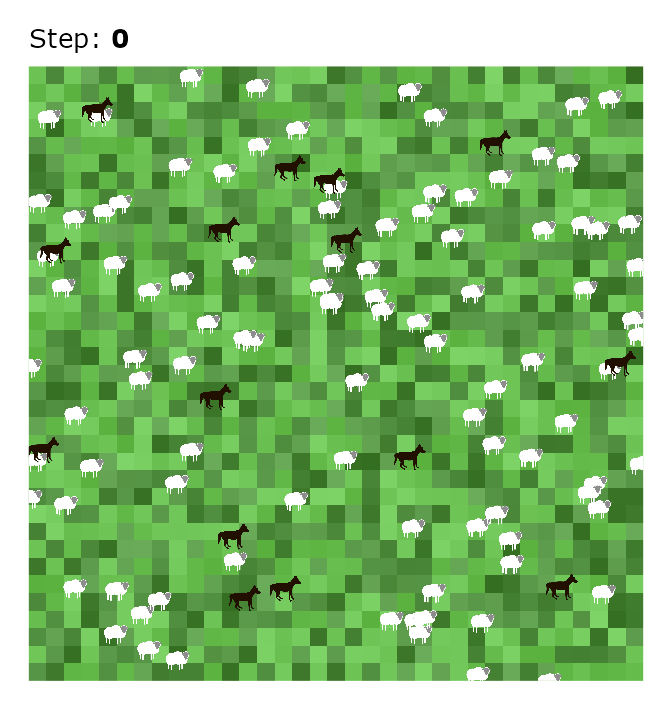
Creating an Animation
Plots are nice, but an animation brings the simulation to life. Let’s use the magick package to stitch our snapshots together.
First, let’s see what steps we have:
steps
#> [1]   0 100 200 300 400 500
Now we’ll generate a PNG image file for each step:
files <- character()

cli_progress_bar("Generating frames", total = length(steps))

for (i in steps) {
  i_plot <- plot_netlogo_world(plot_data, step = i, step_label = TRUE)

  i_file <- tempfile(pattern = paste0("step-", i, "-"), fileext = ".png")

  ggsave(
    filename = i_file,
    plot = i_plot,
    device = agg_png,
    width = 7,
    height = 7.4,
    units = "in",
    dpi = 96
  )

  files <- append(files, i_file)
  cli_progress_update()
}

cli_progress_done()
Finally, let’s combine them into a GIF image:
animation <-
  files |>
  lapply(image_read) |>
  image_join() |>
  image_animate(fps = 1)
Run the following to save it:
animation |> image_write("netlogo-world-animation.gif")And here’s the result:
animation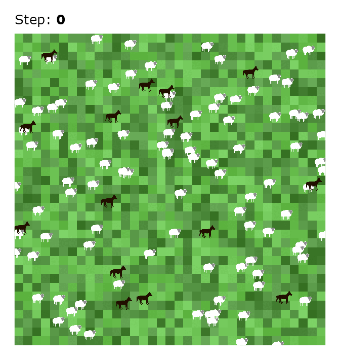
Wrapping up
You now have the tools to visualize any NetLogo simulation. The approach is straightforward: extract agent coordinates at the time steps you care about, convert NetLogo colors to hex, and plot with ggplot2.
Feel free to adapt this for your own models. Just change the metrics to capture whatever agent properties you need. One caveat: animations can get memory-intensive if you’re capturing many steps or have lots of agents, so start small and scale up as needed.